Leica M 50mm lens comparison: 10 fast options - Part 3. Rendering

In the past photographic film was not that fast: ASA (ISO) 25 was the norm. For most of his career Henri Cartier Bresson shot with film that was so slow compared to what we have with digital cameras that one wonders how he did ever manage to get an image without the help of image stabilisation, automatic exposure, autofocus, image preview and all the technology we have access to now. The answer is simple: skill developed in long, long hours of practice. Like all of the greats, he had skills in camera handling, composition and manual focusing, and most importantly an incredible eye derived from endless study and not a care in the world about what gear he was using. He just used what worked for him. A fast lens in those days was necessary for low light. That’s it. The technology available at the time didn’t allow the lens designers to achieve the kind of image quality wide open that we are used to today. Those lenses were soft, full of aberrations, lacking contrast, but they drew a lot of light in and that was their purpose. Shallow depth of field was a problem to contend with, not a feature of a fast lens.
Nowadays uttering the words “fast lens” triggers an atavistic, primal reaction in the typical Leica enthusiast’s lizard brain. Slobbering and dilated pupils are accompanied by tremors and a droning repetition of the mantra: “Bokeeeeehhhh…bokeeeeehhhh…bokeeeeehhhh…”. It certainly isn’t an affliction exclusive to the Leica fandom, but the German manufacturer’s camera owners seem to be particularly terminal with the disease. There is this strange notion, unfortunately reinforced by Mr Karbe (the chief Leica lens designer) during some interviews, that a fast lens should be shot wide open all of the time, to get the fabled bokeh. When you ask why they will then say that it is to draw the viewer’s attention to the subject, to get rid of distractions, to make the image more artistic. What happened to careful composition, checking the background before shooting and making it part of the image instead of blasting it to smithereens? The Leica M seems to have been designed for Documentary, Photojournalistic styles of photography (Street Photography falls very close to these genres), which typically keep the aperture stopped down and show the environment to complement the subject, to give context.
Now, don’t get me wrong: I do like a bokeh rich image as much as the next photographer, but I hardly think a fast lens needs to be always shot wide open. A fast lens CAN be shot wide open, and it should perform well to draw the subject with detail and an impression of three-dimensionality, with a defocused background that is pleasing and unobtrusive. Subject rendering and versatility are more important than the background rendering for me. This is one reason why I didn’t like so much the ultra-fast TTArtisan 50mm 0.95: it is a one trick pony for me, not worth having in my bag. But boy it delivers in the right conditions!
Personal opinions aside, there is a genuine interest in bokeh rendition for fast lenses and some, like the Sonnar 1.5, enjoy a cult status among Leica users. Others, like the Summilux 1.4, are criticised by some for having a bokeh that is too neutral, thus boring. Which tells that some people look at bokeh rather than content in a picture. To each his own: a large portion of this third instalment of the Leica M 50mm comparison will be looking at that bokeh in detail.
Index for this page:
The portraits will be full frame shots only, but at each aperture for each lens.
Bokeh!
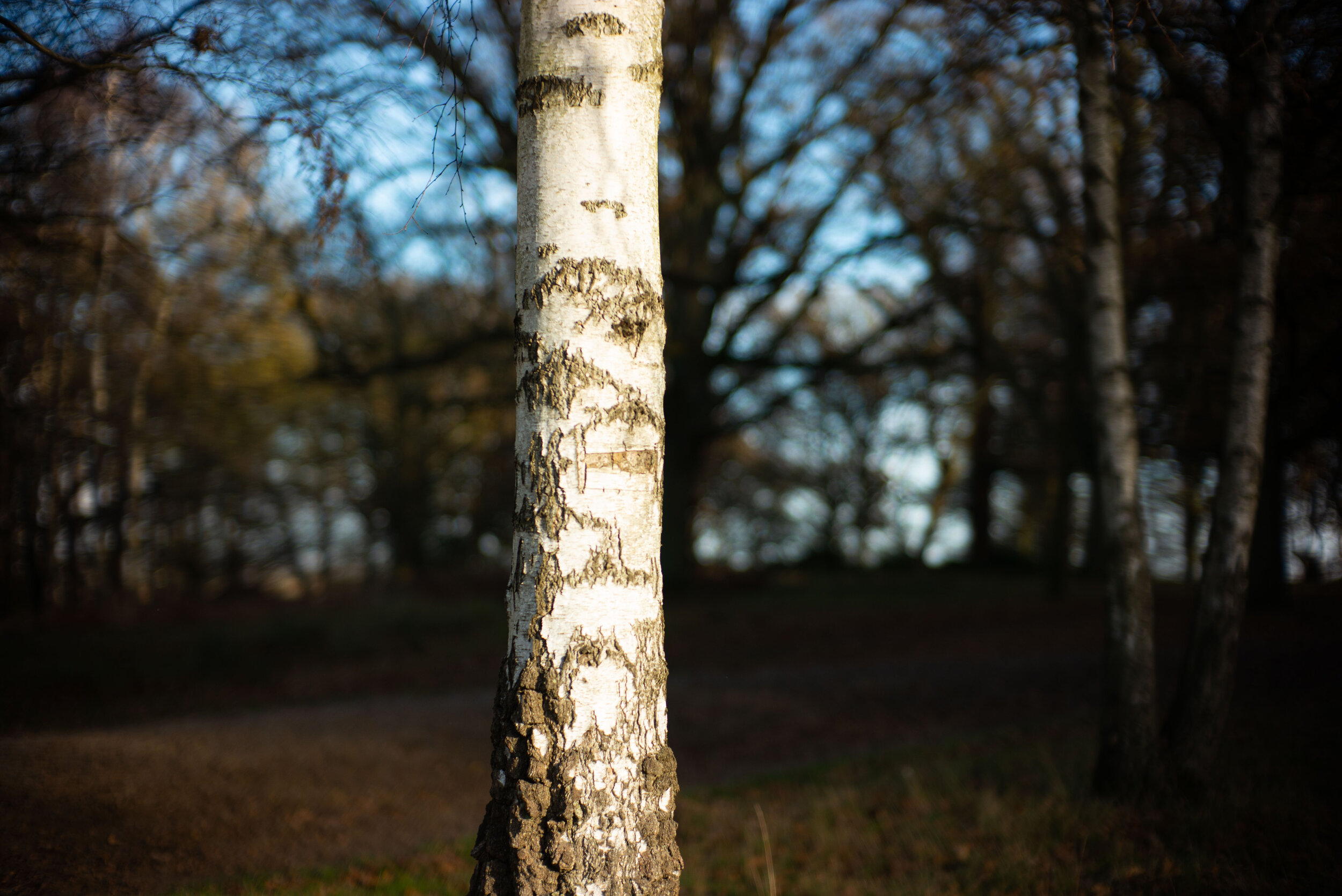
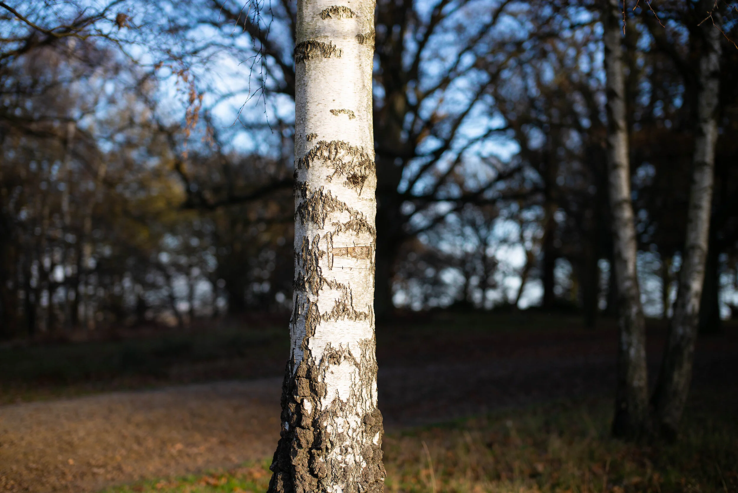
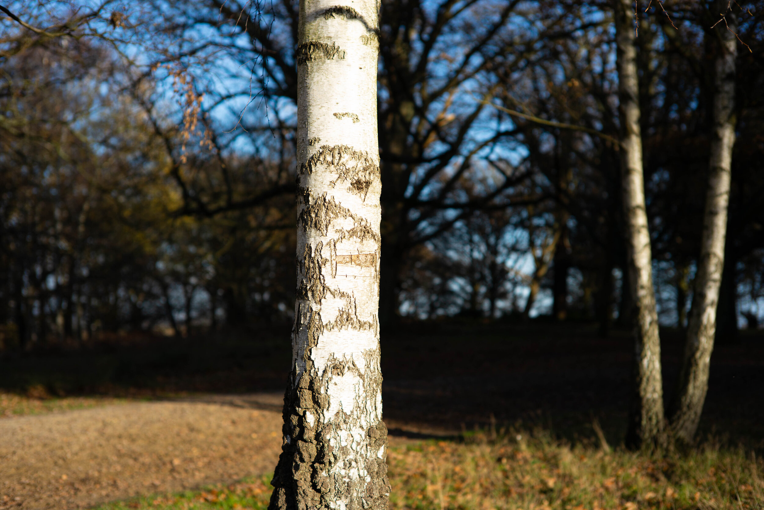
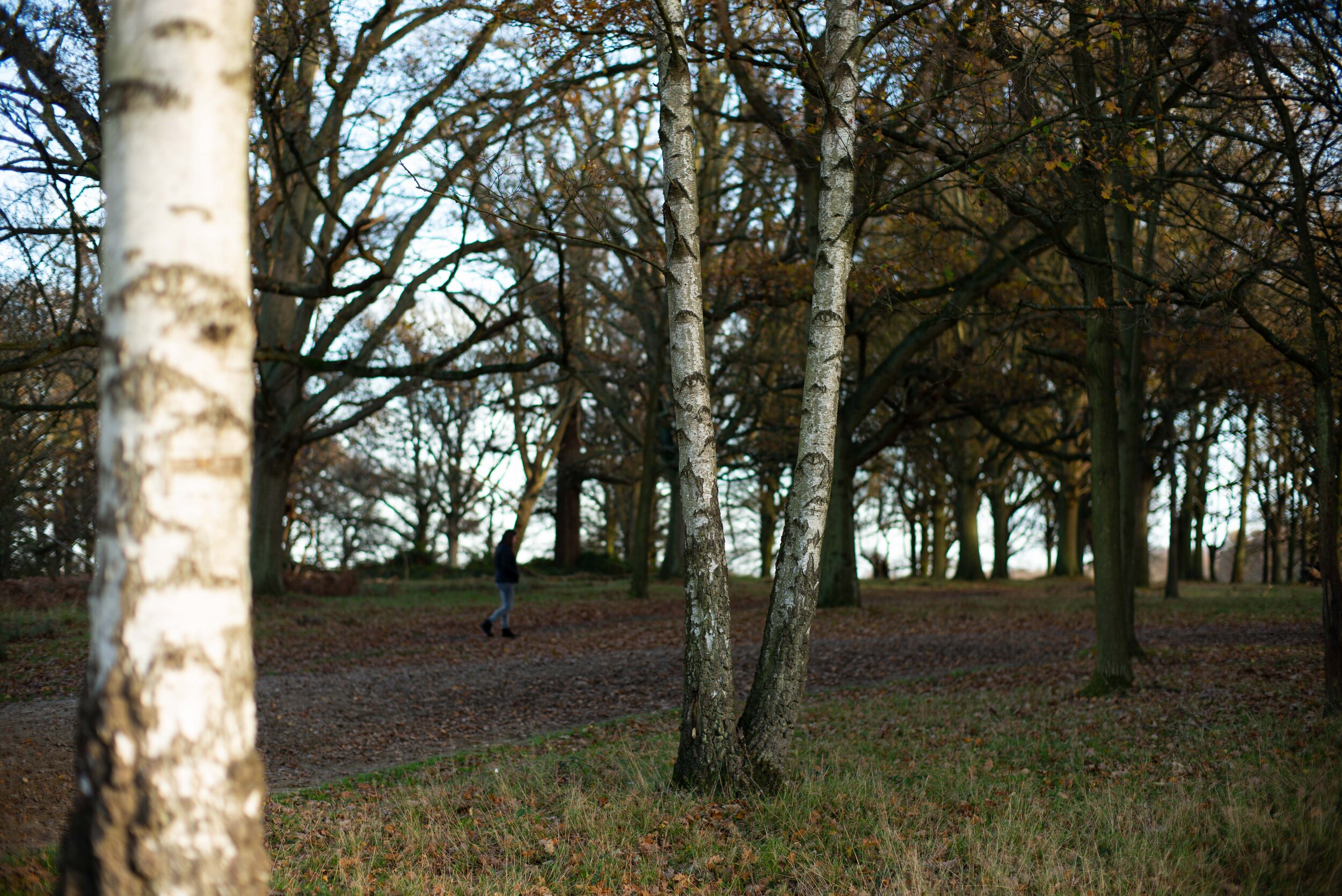
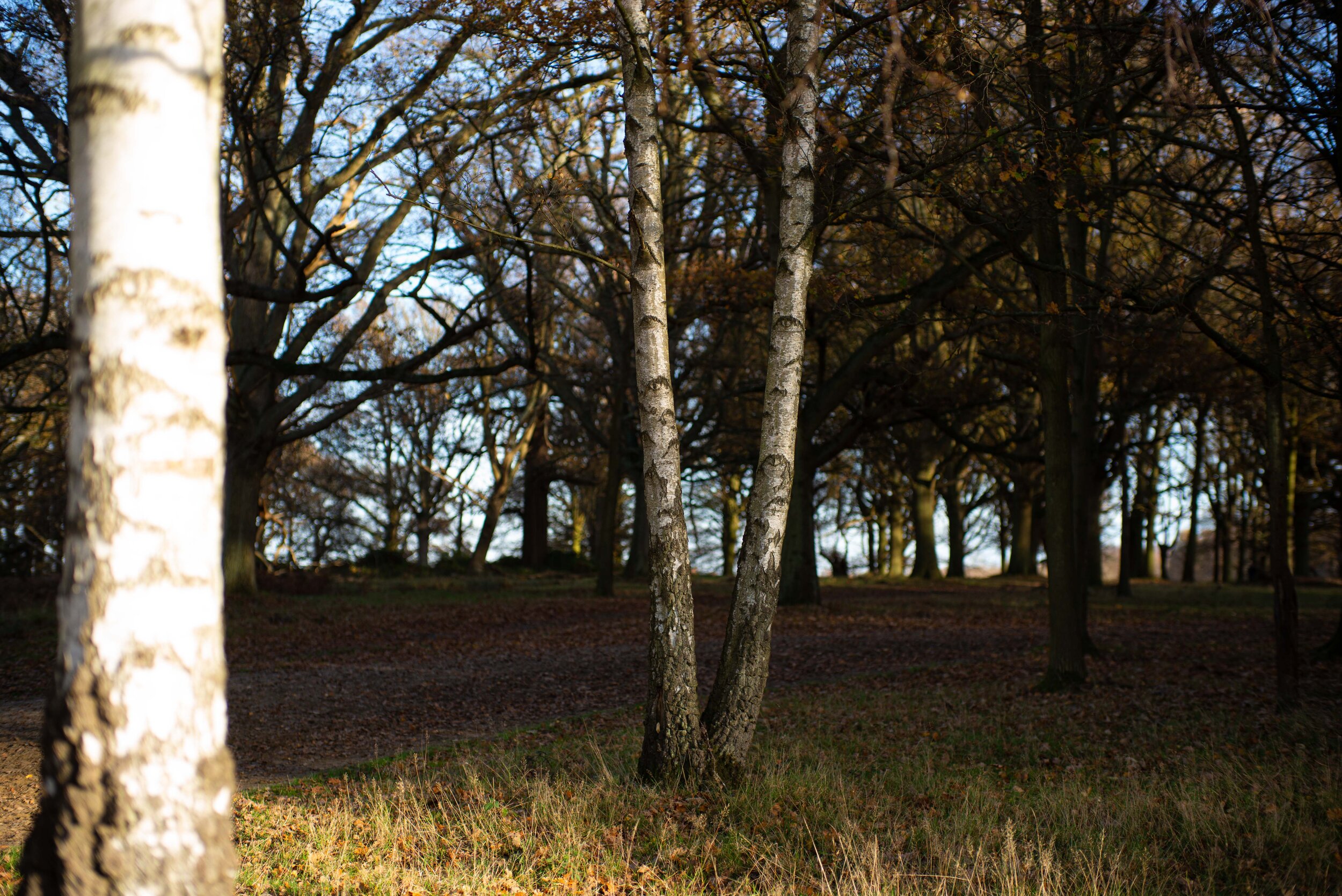
The first series was shot with artificial light from a distance of 1m, with fairy lights in the background to see how the point light sources are rendered. You have seen this setup in the Coma, astigmatism and sunstars section in Part 2 of this comparison. Now you know why that strange picture was used for that test: I caught two birds with a stone there.
In bokeh circles the out of focus highlights (OOFH) are also called bokeh balls, but as soon as we start moving off centre they are often shaped more and more like cat’s eyes (we will call it cat’s eye bokeh, or CEB for simplicity): this is caused by mechanical vignetting, which means that off-centre (off-axis in optical terms) the light path is partially obstructed by the physical lens front ring surrounding the front lens element. This will cause a defined curved edge to the OOFH towards the centre of the image, while towards the corner the shape will be very characteristic of each lens’ optical and aperture design. Some will have defined edges also outwards, some will have smeared outwards edges, some will be shaped differently. Aspherical lenses have a typical “onion ring” bokeh (ORB) appearance in the OOFH, a phenomenon caused by the manufacturing process of most aspherical glass elements: they are ground in a process similar to a lathe, and this will leave a spiral grinding groove in the glass surface that won’t degrade the image or its sharpness but will be visible in the OOFH. Leica uses pressure moulding for most of its aspheres, which reduces this phenomenon somewhat. As a curiosity, in order to eliminate ORB from their lenses Panasonic developed a polishing process a few years ago that involves highly skilled and specifically trained technicians that will polish by hand the aspherical surfaces after the grinding process. Another typical characteristic of bokeh is the green fringing of the OOFH behind the plane of focus and the magenta fringing in front of it. This phenomenon is called spherochromatism: we will abbreviate it as SC. We can see some spherochromatism also in the focus shift test in Part 2 of this article. We will highlight these characteristics in the analysis.
Just for reference, let’s list the main abbreviations related to bokeh that I’ll be using in this section for simplicity and brevity, there are a few:
OOFH: out of focus highlights
CEB: cat’s eye bokeh
ORB: onion ring bokeh
SC: spherochromatism
Let’s start.
Bokeh at close distance
Skip to summary.
F1.1/1.2


The Nokton 1.1 shows a strong yellow-blue outlining of the OOFH and CEB anywhere off centre, then bell shaped bokeh towards the corner. Slight SC is barely visible. Neutral and undisturbing bokeh in front and behind the focus plane where there are no highlights. The 7Artisans 1.1 also shows strong outlining but with all the LaCA typical fringes: blue, yellow, green, magenta. Cute… It shows much rounder OOFH than its ultra-fast competitor, and they become “cylindrical” towards the corner - is that typical for a Sonnar design? The Nokton 1.2 has a lot less outlining but the OOFH show some SC. CEB is not extreme with slightly smeared outwards edges and there is a darker circle inside the OOFH edge. I don’t know what causes it. ORB doesn’t seem to be visible although the OOFH is not as clean as that of a spherical design.
F1.4/1.5


The outlining is replaced by some green SC related fringing on the Nokton 1.1, which also shows defined polygon shaped OOFH caused by the aperture blades profile. The outlining is greatly diminished on the 7Artisans 1.1 as well, with OOFH still nicely circular near the centre. The peripheral ones are getting multicoloured: funky! But not great for image neutrality. Is that strong magenta due to the colour vignetting? SC is minimal, less than on the Nokton 1.2 that still shows it in its polygonal OOFH. The Summilux 1.4 shows a stronger yellow outline on the brightest OOFH. ORB is there but almost imperceptible. CEB seems very, very similar to the Nokton 1.2. The TTArtisan 1.4 has a very different bokeh character: no outlining, minimal SC, visible ORB, and CEB similar to the Leica and Voigtlander aspherical lenses. Its outwards smearing is peculiar though, very unique to this lens, and it gets enhanced at the sides of the CEB from mid-frame. It’s not obtrusive at all for me, just peculiar. The Nokton 1.5 shows quite some outlining and moderate ORB in its OOFH. Its CEB has the smearing towards the image centre: I guess it’s due to the internal comatic aberration of this lens. No SC visible, contrary to the Nokton 1.5 II that shows it together with a faint outlining of its OOFH. The CEB is stronger on this lens due to a stronger mechanical vignetting. Fantastic to see that this lens, although of aspherical design, shows no ORB at all. Impressive! The Sonnar 1.5 shows a very strong yellow and blue outlining in the medium brightness OOFH, consistent with its LaCA, just yellow on the brightest ones. Slight SC appears on the inwards edge of the OOFH from mid-frame. CEB is not pronounced, getting towards a cylindrical shape in the corner, like its Sonnar design cousin by 7Artisans.
F2


All lenses are now participating: the Nokton 1.1 still shows a faint outlining with its SC. The 7Artisans 1.1 is still offering coloured special effects in the outer part of the frame, strong outlining but low SC. The central OOFH are still almost perfectly round, barely affected by the shape of the aperture blades. The Nokton 1.2 has less SC and the polygonal shape is less pronounced in the OOFH. Curious shapes on the peripheral OOFH, which seem trapezoidal in the far corner. The Summilux 1.4 has now less but still strong yellow outlining and minimum SC. The OOFH are already showing one of the most criticised traits of this lens by the bokeh aficionados: the dreaded “ninja-star bokeh”. In this instance I’d say it resembles more a circular saw blade, but we are nit-picking now. It certainly isn’t particularly attractive, but hardly worse than the polygonal shapes from the straight-bladed apertures at this stage. The TTArtisan 1.4 has exactly the same amounts of SC and yellow outlining, just on smaller and now circular saw blade shaped OOFH, slightly less defined than the Leica ones (it has more aperture blades - 12 for the Chinese, 9 for the German lens). The Nokton 1.5 still shows the strong yellow outlining mixed with some SC and polygonal OOFH. The polygonal shape is less disturbing with the Nokton 1.5 II thanks to 12 instead of 10 blades in the aperture. The SC is still at the same level. The Sonnar 1.5 has greatly improved on the outlining issue. A faint circular saw blade shape is appearing. The Summicron F2 is wide open here: it shows a little outlining, yellow outwards and green (SC) inwards. CEB is certainly not strong. The Planar F2 has a similar outlining but no yellow, just green from SC. Its CEB is also very mild.
F2.8


Now the bokeh character is changing less: the OOFH are getting smaller but the aberrations are not changing a lot. The Nokton 1.1 and Nokton 1.2 are very much the same with polygonal but unobtrusive OOFH, the 7Artisans 1.1 has given up the special effects on the corner, still showing very round OOFH. The Summilux 1.4 is now transitioning towards ninja-stars from circular saw blades for its OOFH, while the TTArtisan 1.4 ones are much less defined but still a bit jagged. The Nokton 1.5 and Nokton 1.5 II now look almost exactly the same, with very minor aberrations. So does the Sonnar 1.5, that has improved dramatically and is different from the two Noktons only in the shape of the OOFH, which are looking slightly more like a circular saw blade. The Summicron F2 shows octagonal OOFH (it’s the lens with the smaller amount of aperture blades here, only 8) and still some blue and yellow in the corner ones. The Planar F2 is looking just the same as all the Noktons and the Sonnar sibling.
At F4 all lenses perform exactly equally. The only differences are the polygonal shapes of the OOFH, but they are so small that they are insignificant. There is no point in comparing them any further.
Here are three grids to compare the frames and to pixel-peep centre and corner crops. Click on them to see them better. Should you want to peruse larger versions please click here for full frame, here for centre crops and here for corner crops.


Summary for the bokeh at close distance
Most lenses show a very strong yellow dominance in the OOFH outlining. Although the artificial light was colour balanced for the candle and the warm LED fairy lights, I believe the warmth of those lights has a role in such a prevalent colour dominance. Correct me if I’m wrong, please. Also, when I say CEB is gone it means that the shapes are not eye shaped anymore, although a little mechanical vignetting might still be visible: those shapes will be more or less irrelevant in the image because less obtrusive unless you have foliage in the background in the corners. See the bokeh at 3m distance and 6m distance sections for that.
The Nokton 1.1 shows a strong yellow and moderate blue outlining in the centre and a stronger SC green in mid-frame and corner. Much improved at F1.4 but the SC gets more visible. At F2 the lens is really good. The CEB is moderate wide open, gone at F2. The 10 aperture blades give a defined polygonal shape to the OOFH when stopping down. The 7Artisans 1.1 also shows strong outlining but it features green, magenta, yellow and blue in them, due to LaCA. No CEB but elongated, cylindrical shapes towards the edges and corners with strong colouring, especially a magenta shading probably due to the colour vignetting afflicting this lens. OOFH are round until F2, faintly polygonal after that thanks to its 13 rounded aperture blades. The Nokton 1.2 shows a faint outlining and a visible SC that will disappear at F2.8. CEB is moderate at F1.2 and F1.4. The 12 sided polygonal shape is quite pronounced at F1.4 and lessens stopping down. No ORB is visible, which is amazing, but the OOFH is not as clean as a spherical design lens. The Summilux 1.4 shows moderate yellow outlining that disappears at F2.8 and a very slight SC. A moderate CEB wide open will disappear at F2. There is some discernible ORB. The OOFH become jagged due to the 9 inwardly curved aperture blades, giving a defined circular saw blade outline at F2 and F2.8. The TTArtisan 1.4 shows the same artefact in its OOFH but less pronounced due to a higher number of aperture blades (12). Wide open it has no outlining but visible SC and severe ORB. CEB is moderate and gone by F2, but there is a peculiar outward smearing of its OOFH till mid-frame and then from the CEB angles towards the corner. SC disappears at F4. The Nokton F1.5 shows strong yellow and faint blue outlining with moderate ORB levels. The outlining never disappears in the corner while it does in the centre at F2.8. CEB is mild and gone at F2.8, and so is the moderate amount of SC. The OOFH have a defined 10 sided polygonal shape at F2 and F2.8, while the Nokton 1.5 II has less defined and 12 sided ones, less obtrusive. The newer Nokton shows mild outlining and moderate SC, both gone at F4. The CEB is moderate to severe due to the strong mechanical vignetting. The lens is exceptional for the absolute cleanliness of the OOFH from ORB notwithstanding its aspherical design. The Sonnar 1.5 shows strong yellow and moderate blue and red outlining which disappear at F2.8. No CEB on this lens, only elongated shaped like the 7Artisans 1.1, likely due to the shared Sonnar optical design. Mild polygonal shape for the OOFH at F2, becomes jagged till F4. There is almost no SC. The Summicron F2 shows moderate blue-yellow outlining that worsens in the corner but is mostly gone by F4. There is some faint SC and mild CEB. The OOFH get an 8 sided polygonal shape on stopping down. The Planar F2 shows moderate white outlining and SC which will disappear almost completely by F4. The CEB is mild and the OOFH get a 10 sided polygonal shape that is fairly unobtrusive.
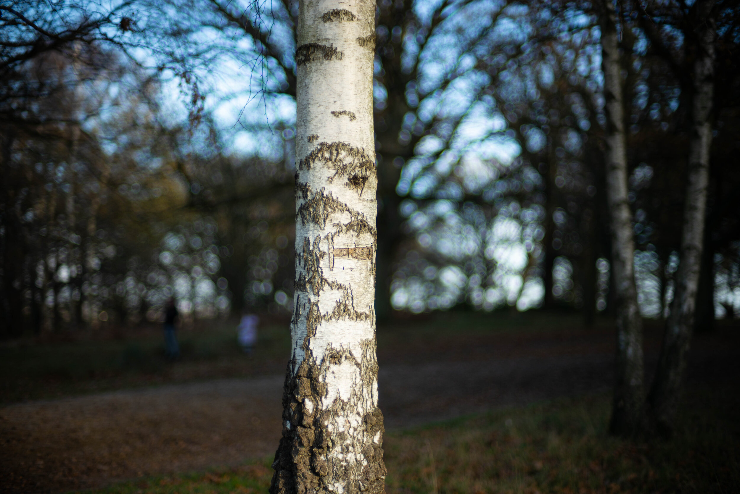
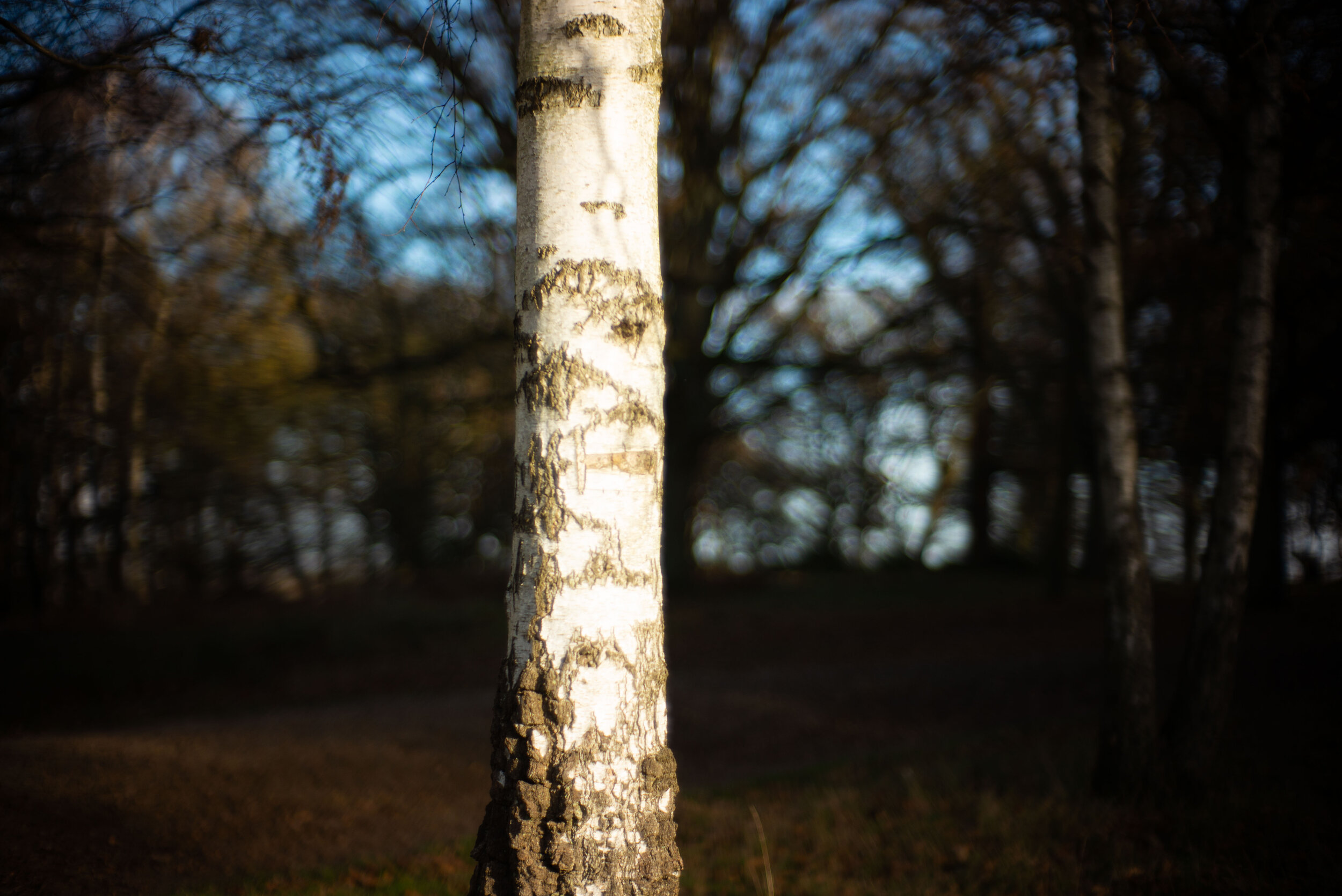
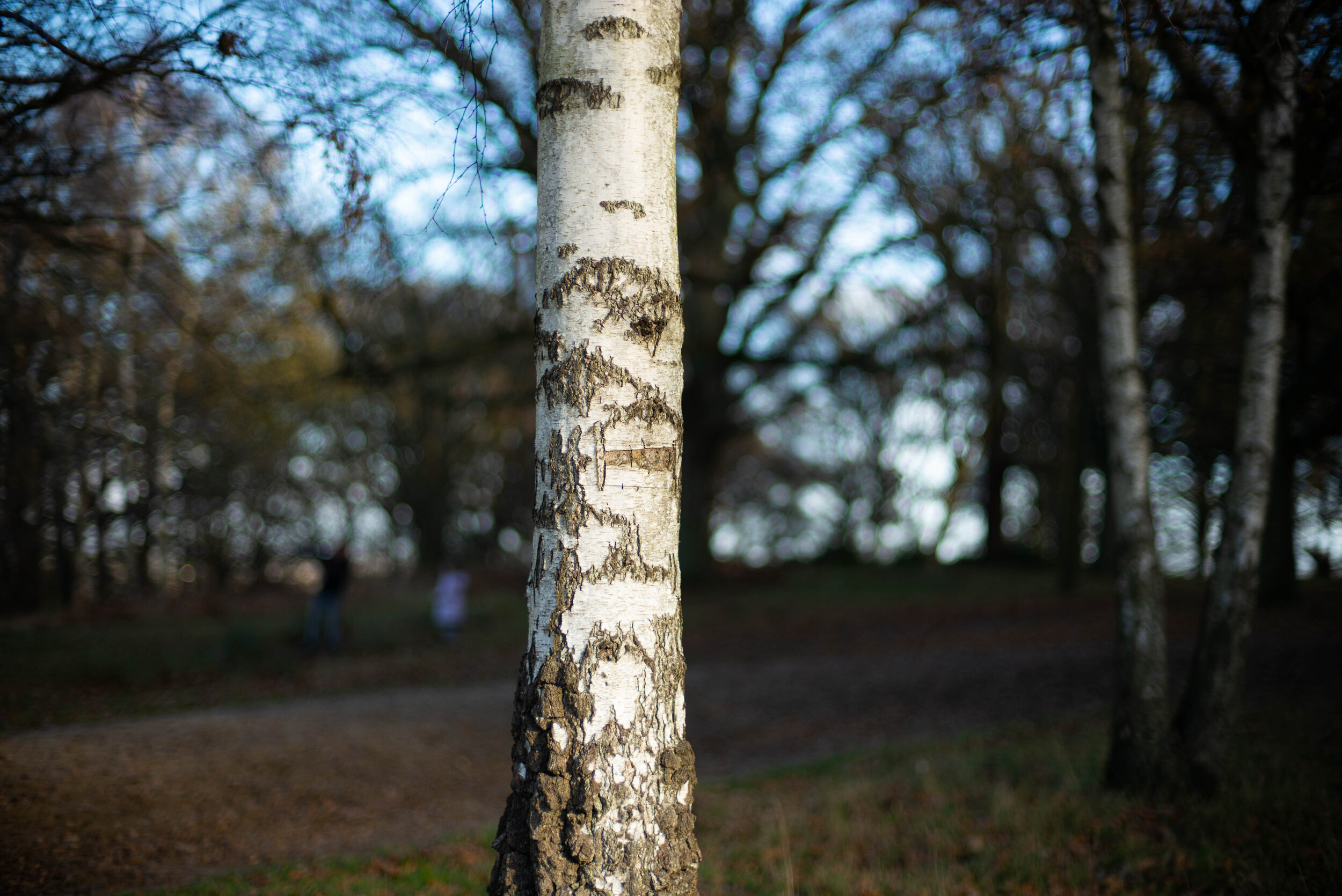
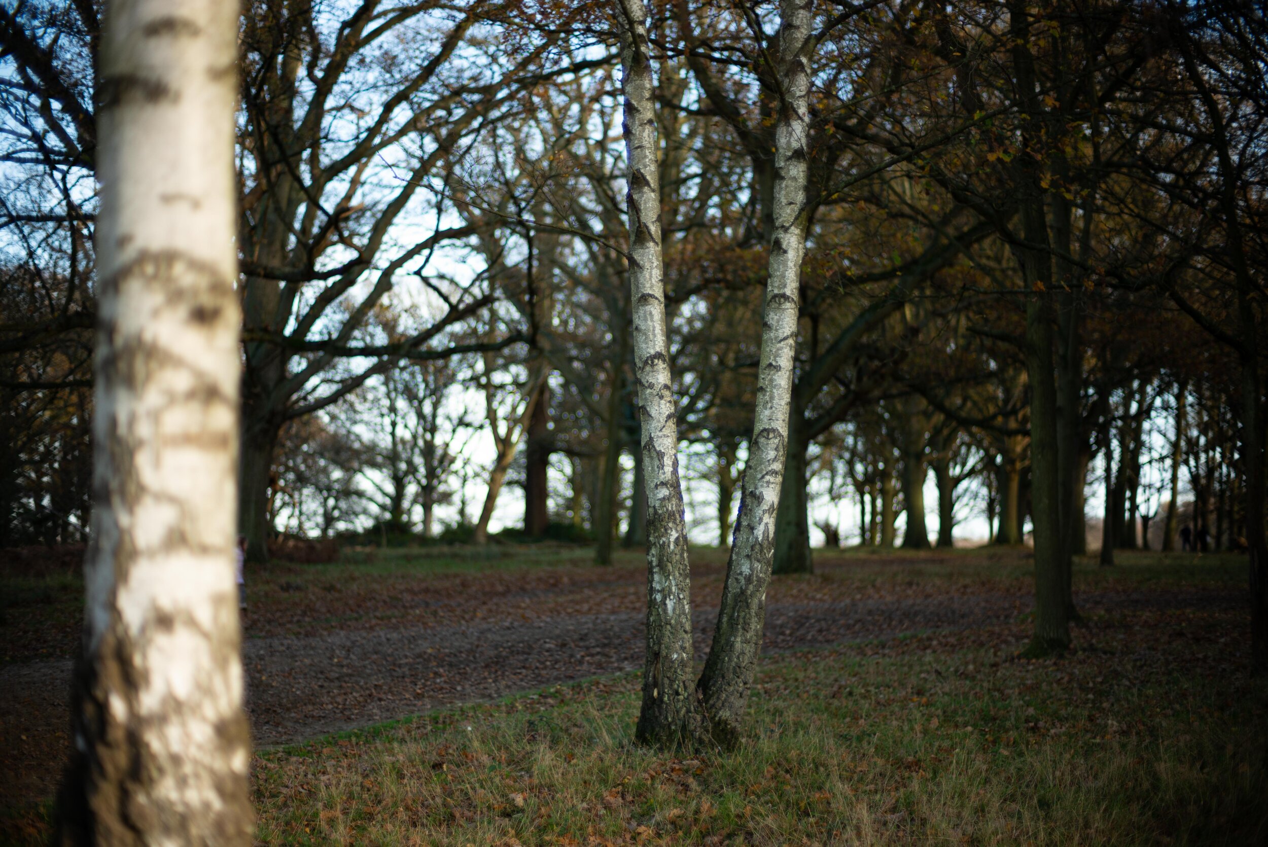
Bokeh at 3m
I chose a handsome tree trunk as a subject for several reasons: first and foremost, a tree will stay still for as long as I ask without complaining. Another important reason is that it was, unsurprisingly, standing in front of other trees and, most importantly, there was plenty of foliage against the bright sky. That background is the bane of any wannabe sweetheart fast lens wanting to seduce their owner into a long and stable relationship. The more outlining or SC in the background bokeh, the more strained the relationship for some, the more idyllic for others. Why? Because Bokeh, a Japanese word that indicates, in a photographic context, the aesthetics of the background blur, is subjective! Some like it “nervous”, some like it smooth, some like it swirly. There is no lens that does it objectively right (pun intended!). But, in my opinion, the more neutral (read: smooth) it is, the better. On the other hand, if your picture has great content, the audience will never concentrate on the quality of your Bokeh. Only us geeky photographers look at that. Shall we do that then? Let’s geek it out!
Given the complexity of the background I will be analysing the image to a lesser extent. The optical aberrations that we highlighted in the previous section should give us an idea of what we might find here, but we will look at a more general look to the whole image rather than fine details. At the end of the section you will find comparison grids with the same images for all lenses, centre crops and corner crops.
You can skip to the summary if you want to forgo the images and analysis.
F1.1/1.2

The Nokton 1.1 shows what you would call a nervous bokeh character. It shows a lot of outlining and SC, with green outer fringes and magenta filling in the OOFH. The 7Artisans 1.1 has a nervous bokeh as well but shows a lot less SC in it. The sun just popped out of the clouds in the Chinese lens shot: look at the spherical aberration glow on the tree trunk! If you wondered what a smooth background would look like compared to the nervous one we just saw take a gander at the Nokton 1.2 image: beautiful, soft and smooth bokeh. That is what I like personally. The SC is visible but irrelevant for the aesthetics of the image. The SC on the Nokton 1.1 is more obtrusive I believe, but not enough to actually disturb the image.
F1.4/1.5
The Nokton 1.1 is a lot smoother in the central portion of the image but there is no change towards the periphery. The 7Artisans 1.1 does the same, and gets a lot more detail in the tree! The Nokton 1.2 still looks great, there wasn’t much to improve there for me. The Summilux 1.4, a lens enjoying a reputation for smooth (and boring according to some) bokeh, looks exactly the same as the Nokton 1.2: if you think it shows less SC you are mistaken, the diminished green is just due to the pinkish colour signature of the lens itself. The TTArtisan 1.4 is ever so slightly more nervous, showing a little outlining to the OOFH but a similar amount of SC. The Nokton 1.5 shows a little more outlining again, while the Nokton 1.5 II has no outlining, a very smooth bokeh, but shows a hint of swirl (loot at the left portion of the frame) due to its pronounced CEB. I have to really look for it to notice though. The Sonnar 1.5 is very slightly more wiry due to a little outlining but not obtrusively so. The difference from the Nokton 1.5 II is mostly visible in the left portion of the image: no swirl.
F2


All lenses are starting to look awfully similar, but I would say that the softest, smoothest background at F2 is now the 7Artisans 1.1. Just beautiful. The Sonnar 1.5 is roughly the same. The others are virtually indistinguishable. The only ones showing a slightly stronger outlining are the wide open F2 lenses, which are showing a difference between them only in the field of view (wider for the Planar F2) and the colour signature (a little cooler for the Summicron F2).
F2.8


At this point the only discernible differences are given by the colour signature, angle of view and image distortion of each lens. The bokeh is absolutely indistinguishable among all of them. If you are still trying to find differences you have no interest in photography, just in technicalities. Just try to cover the lens name with your thumb, skip through images a random number of times (don’t count) and then open your eyes and try to guess the lens from the bokeh character: you can’t. You need the other parameters, and still you will also try and jog your memory for the light quality in each lenses’ series, which was different (that’s what you get when you have big clouds wandering in the sky!).
There is no point in showing any other examples at 3m distance, there is no difference anymore.
To see bigger versions click here for full frame, here for centre crops, here for corner crops.


Summary for the bokeh at 3m
The first thing I noticed in this series is that every single lens shows strong SC in the form of green around the tree branches and OOFH, purple/blue inside the OOFH, although in different amounts. Overall though these colours do not disturb the image as much as the OOFH outlining in my opinion: the latter causes what is called “nervous” or “wiry” bokeh, rendering the background slightly more jarring. Looking at the lenses wide open the Nokton 1.1 and 7Artisans 1.1 are prime examples of nervous bokeh caused by outlining, while the Nokton 1.2 has very little of it, thus rendering a much softer, neutral background. The Summilux 1.4, TTArtisan 1.4 and Nokton 1.5 II are also very soft and neutral, while the Nokton 1.5, Sonnar 1.5, Summicron F2 and Planar F2 all show a little outlining that robs that background of softness. As soon as we stop down each lens one stop (or two for the fastest 1.1 boys) the outlining tends to mostly disappear and the backgrounds become softer. The corner blur is less elegant on the Nokton 1.1 but overall no lens is particularly distracting there.
Bokeh at 6m
This is the same setup, I just focused on another tree at 6m from the camera. Click here to skip to the summary.
F1.1/1.2
The Nokton 1.1 shows again some nervousness and we can see strong SC in the OOFH in the form of a very strong green fringe and dense purple-blue spot inside. You need to pixel peep to see it though! In the corners the image is sharpening up thanks to the negative field curvature (FC) of the lens, while the OOFH take on an arrowhead shape. I’m not a fan of this look. The 7Artisans 1.1 is showing similarly outlined OOFH but less colour from SC. The arrowheads are much less pronounced but the corners are sharper than the centre as well. Notice the very wiry bokeh rendering in front of the plane of focus, visible on the tree trunk in the foreground. The Nokton 1.2 does now show prominent SC and sharpening in the corners but the rendering is smoother than the other two.
F1.4/1.5

The Nokton 1.1 does not really improve: while it loses marginal amounts of outlining it acquires a more dense purple colour in the OOFH circles. The 7Artisans 1.1 does improve instead in the central portion of the image. The Nokton 1.2 has a barely perceptible improvement in the centre as well, but not significant in my opinion. The Summilux 1.4 looks exactly the same as the Nokton 1.2: the image is just lighter. The corner is sharp as tack though. The TTArtisan 1.4 shows a stronger outlining than the Voigtlander 1.2 and Leica counterparts but the same amount of SC. Sharper corners as well. The Nokton 1.5 shows almost the same character as the Chinese lens here but even sharper corners. The Nokton 1.5 II is surprisingly smooth and free of outlining, giving a much nicer rendering, but showing quite some SC. Tack sharp corners here as well. The Sonnar 1.5 has the same amount of SC but outlined OOFH, although less than the Nokton 1.5 and TTAtisan 1.4. Very sharp in the corner. The Nokton 1.5 II is the best performer here, followed closely by the Summilux 1.4 and Nokton 1.2, then the Sonnar 1.5. These lenses just look good if you look at the image in its entirety. The others might let you notice the lesser quality of the bokeh.
F2


If you look at each image at 100% magnification in the central portion you will not see any significant differences: they all look almost exactly the same, allowing for differences in illumination. The only exceptions are the Nokton 1.5 II, that is the only one with truly soft bokeh, and the Summicron F2 and Planar F2 which, apart from looking exactly the same way, have a marginally more pronounced outlining but just because they are still wide open. In the corner all lenses are definitely sharper than in the centre. The Nokton 1.1, 7Artisans 1.1 and TTArtisan 1.4 simply have pretty bad corners but it should be helping at this point to even the image out. The others have varying degrees of detail in the corner, with the Nokton 1.2 being the one with the least field curvature it seems. More of the same at F2.8 across the board: I really see no further significant difference worth analysing at this stage. Again, if you are still looking for differences at this point you should probably be letting go of photography and getting into image analysis for the FBI.
As usual, here are the comparison grids. As usual, if you want larger versions, click here for full frame, here for centre crops, here for corner crops.


Summary for the bokeh at 6m
All lenses show a degree of sharpening in the corner in this series. It is curious because some of them show flat or positive field curvature on close focusing as seen in Part 2, but now all of them seem to have a negative field curvature. I wonder if part of this phenomenon might be due to the mechanical vignetting at the extreme corner acting effectively like a stopped down diaphragm, creating more depth of field and sharpness in the corner? Please do correct me if I’m mistaken! Also, most lenses show quite some SC in this setting, but it’s barely visible and not obtrusive in this kind of image. At this distance some lenses show a different character and that’s not necessarily an improvement. The Nokton 1.1 and 7Artisans 1.1 are still pretty wiry and show arrowhead shaped OOFH in the corner (the Voigtlander especially). Those corners don’t look great, but only if you look closely: you wouldn’t shoot a landscape this way and if you are looking to blur the background it means that you got a compelling subject in sharp focus drawing the eye a lot more than such small artefacts. The Nokton 1.2 is not as buttery smooth as it is at 3m but still has softer bokeh than the faster 1.1 lenses. Some slight outlining is also seen when wide open in the Summilux 1.4 and to a larger extent in the TTArtisan 1.4, Nokton 1.5 and Sonnar 1.5, while the Nokton 1.5 II surprises again with no outlining and a very smooth background. At F2 all lenses look equal in the central portion of the frame with three exceptions: one is the Nokton 1.5 II again, smoother than the others. The other two are the Summicron F2 and Planar F2: they show slight outlining because they are wide open. By F2.8 there are no relevant differences in character anymore across all designs.
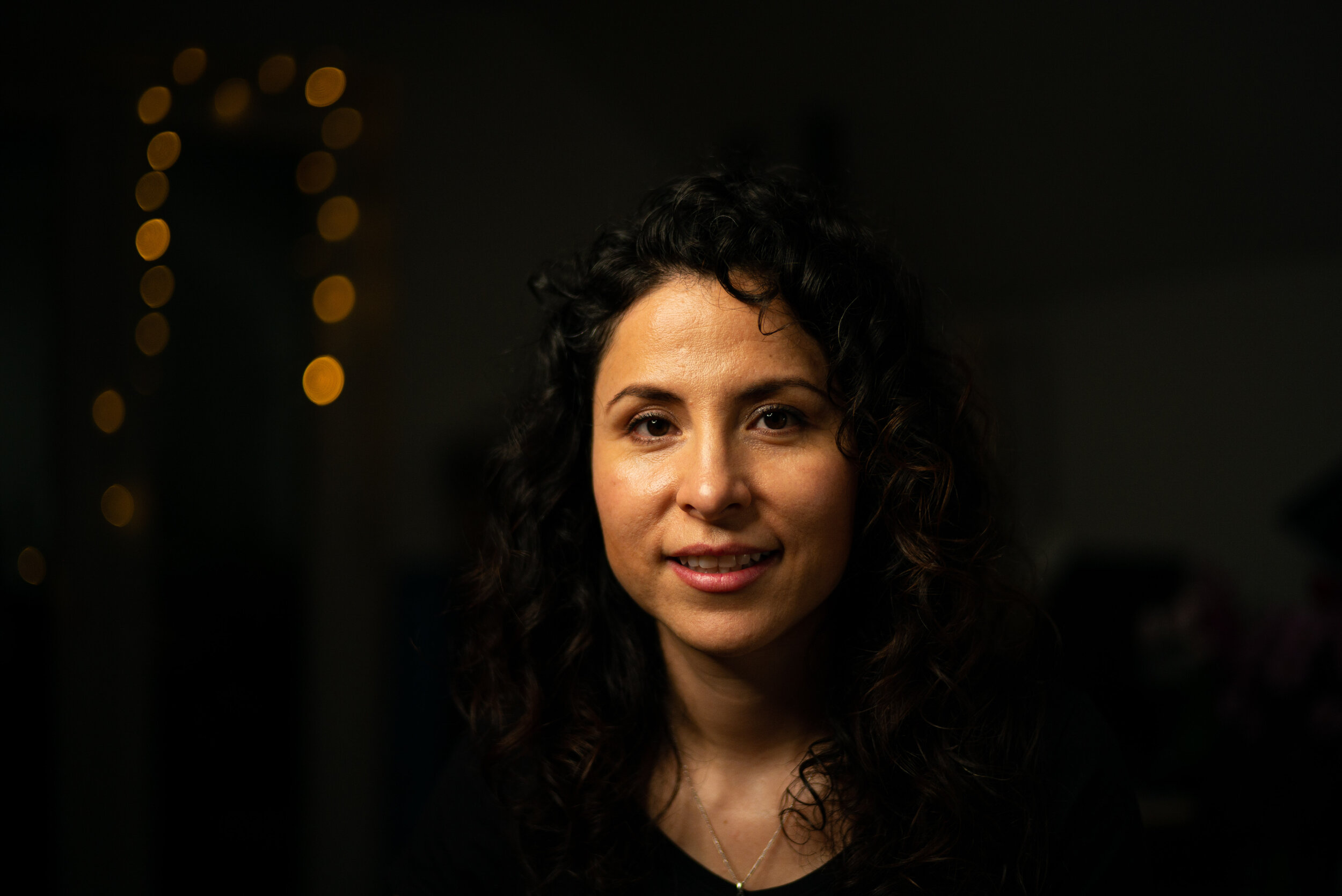
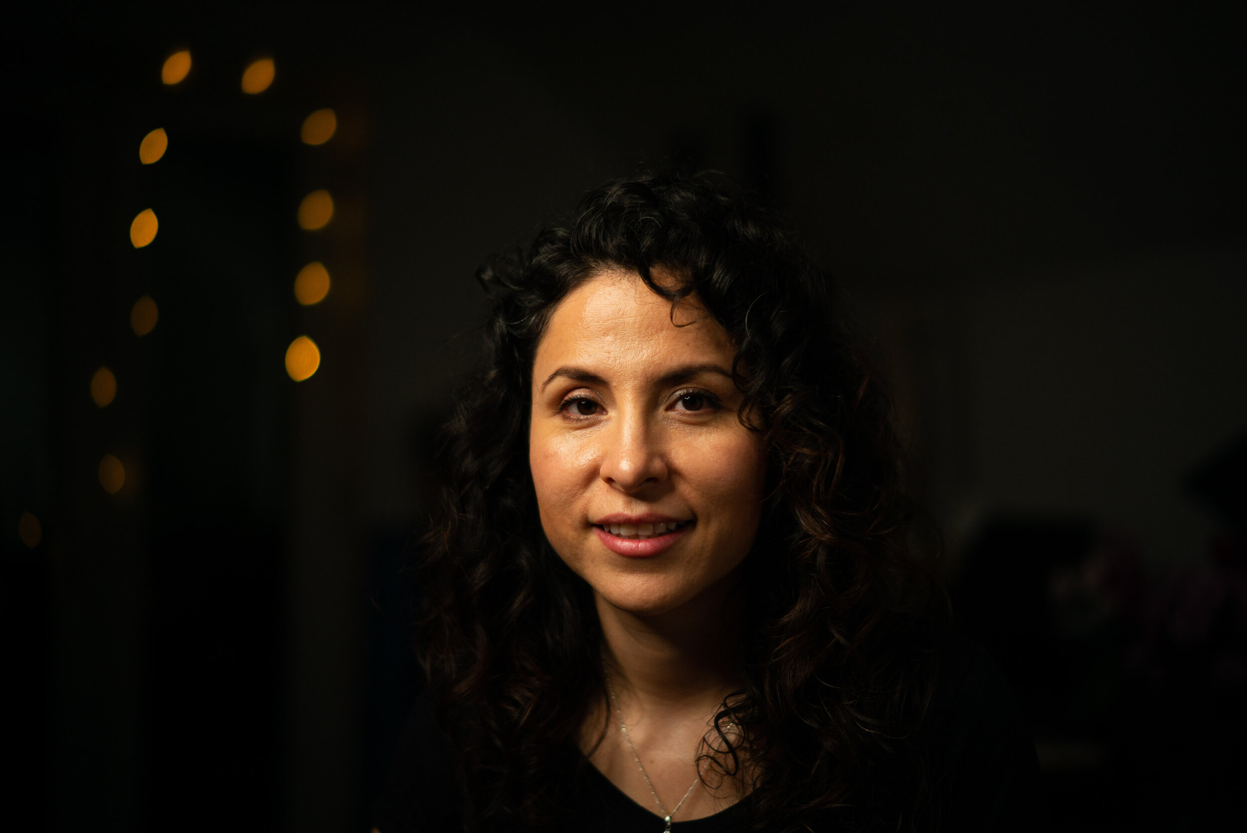
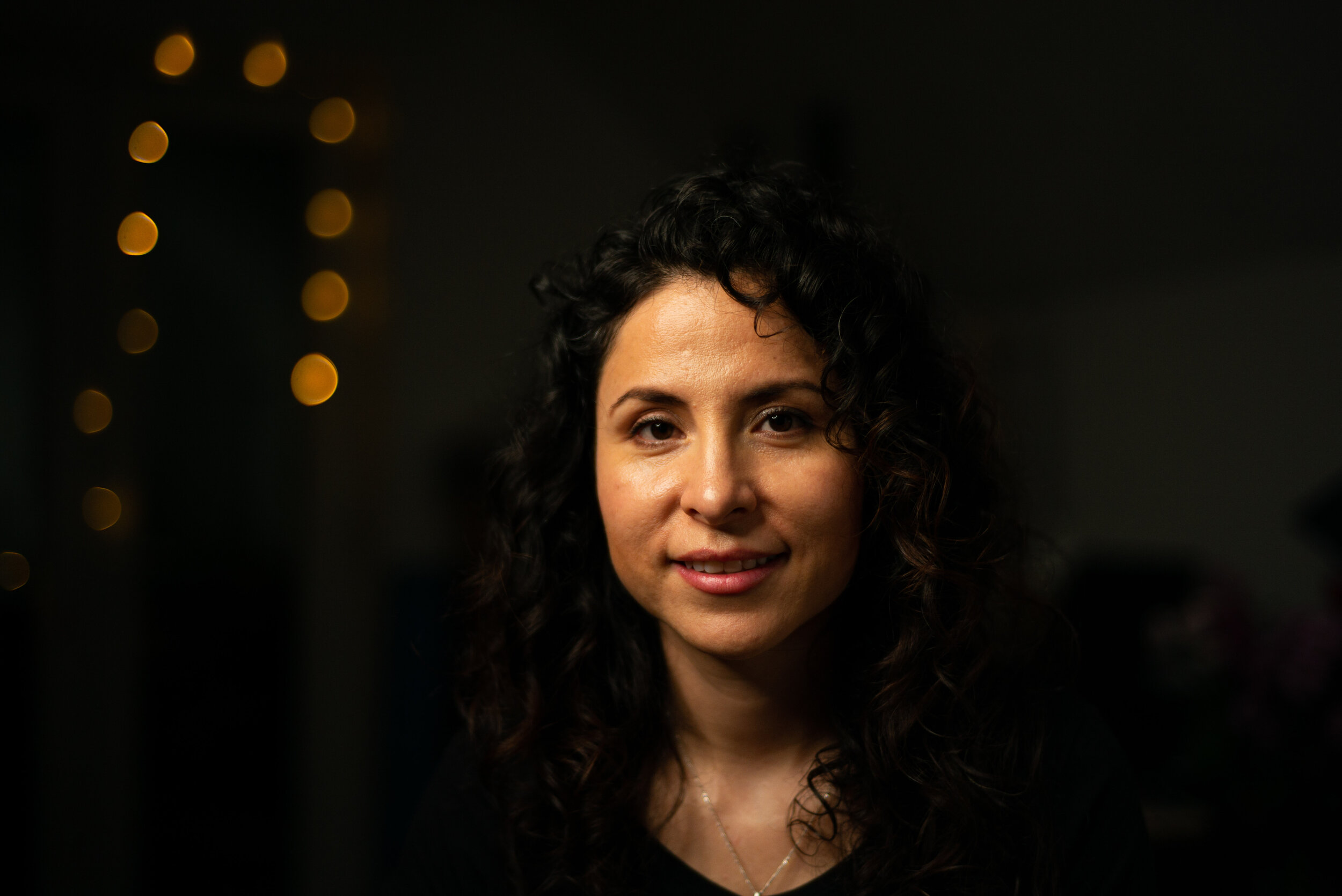
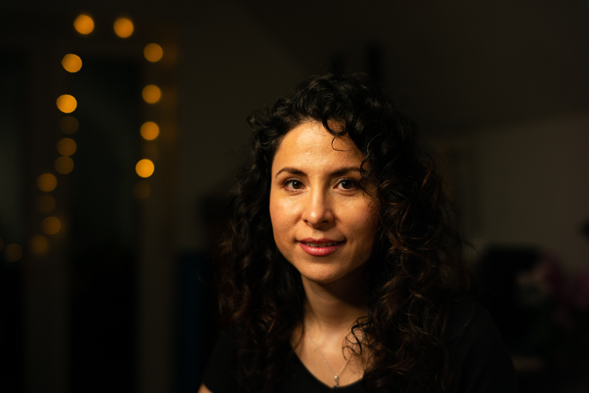
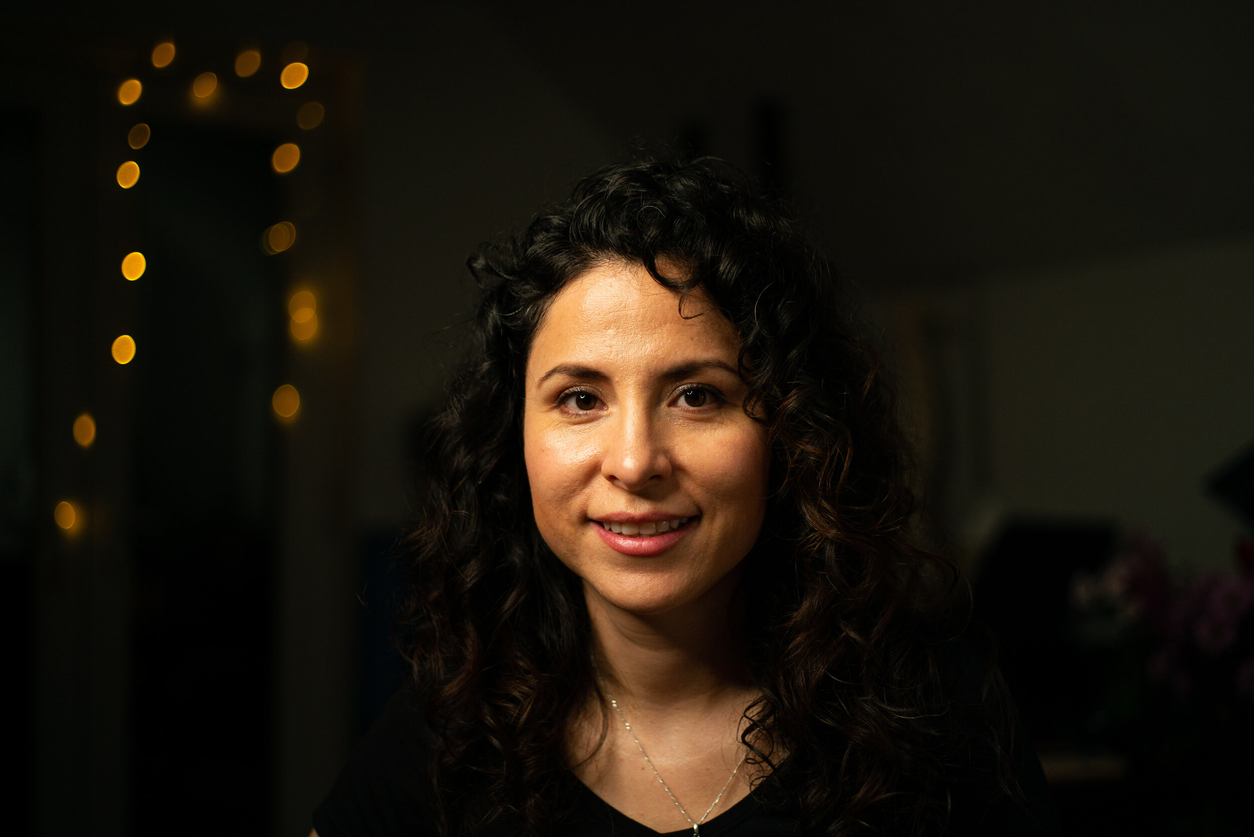
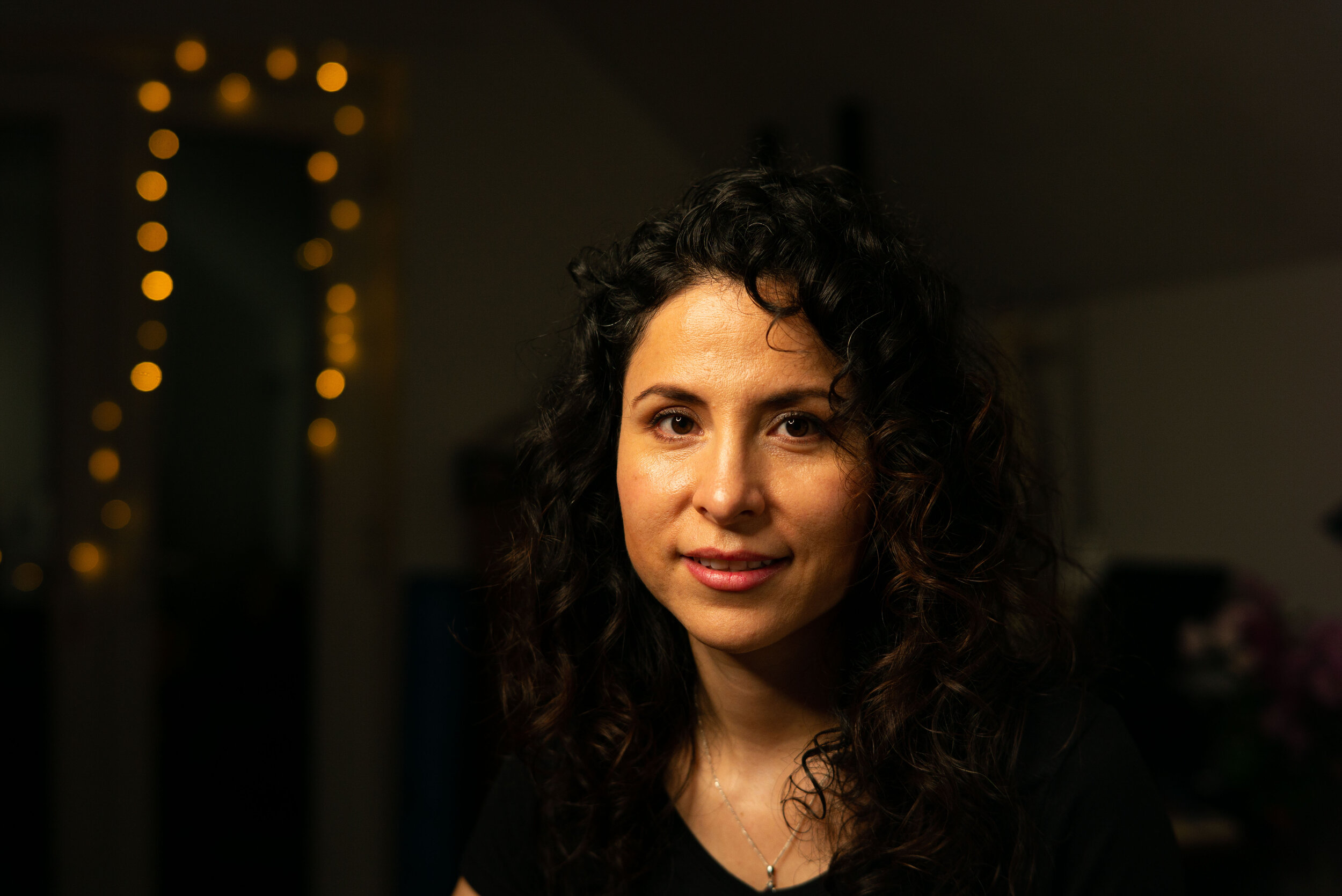
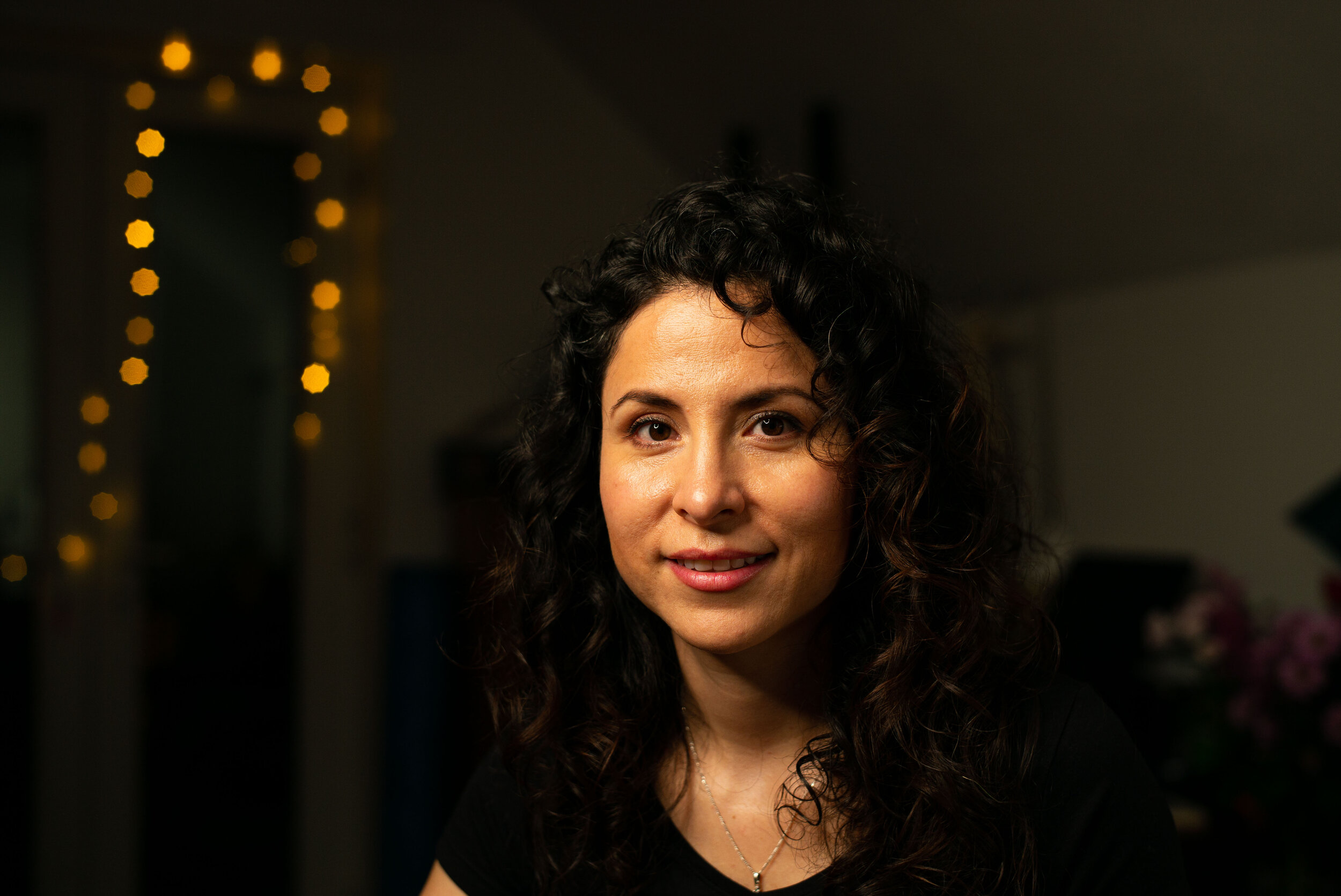
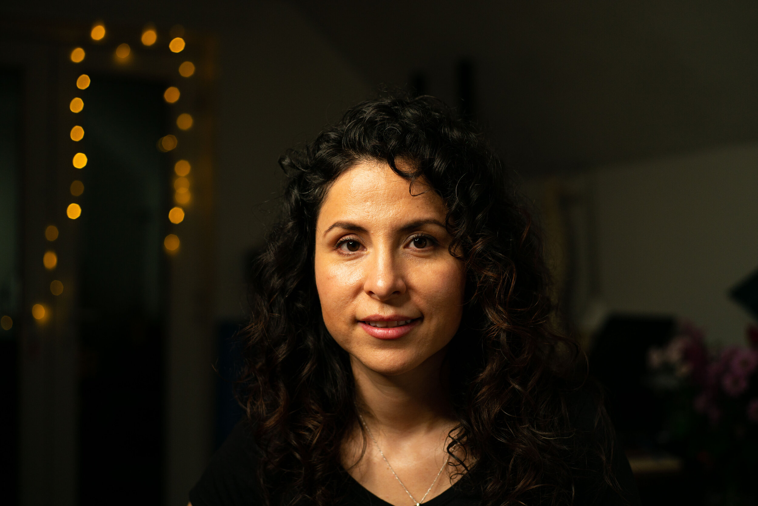
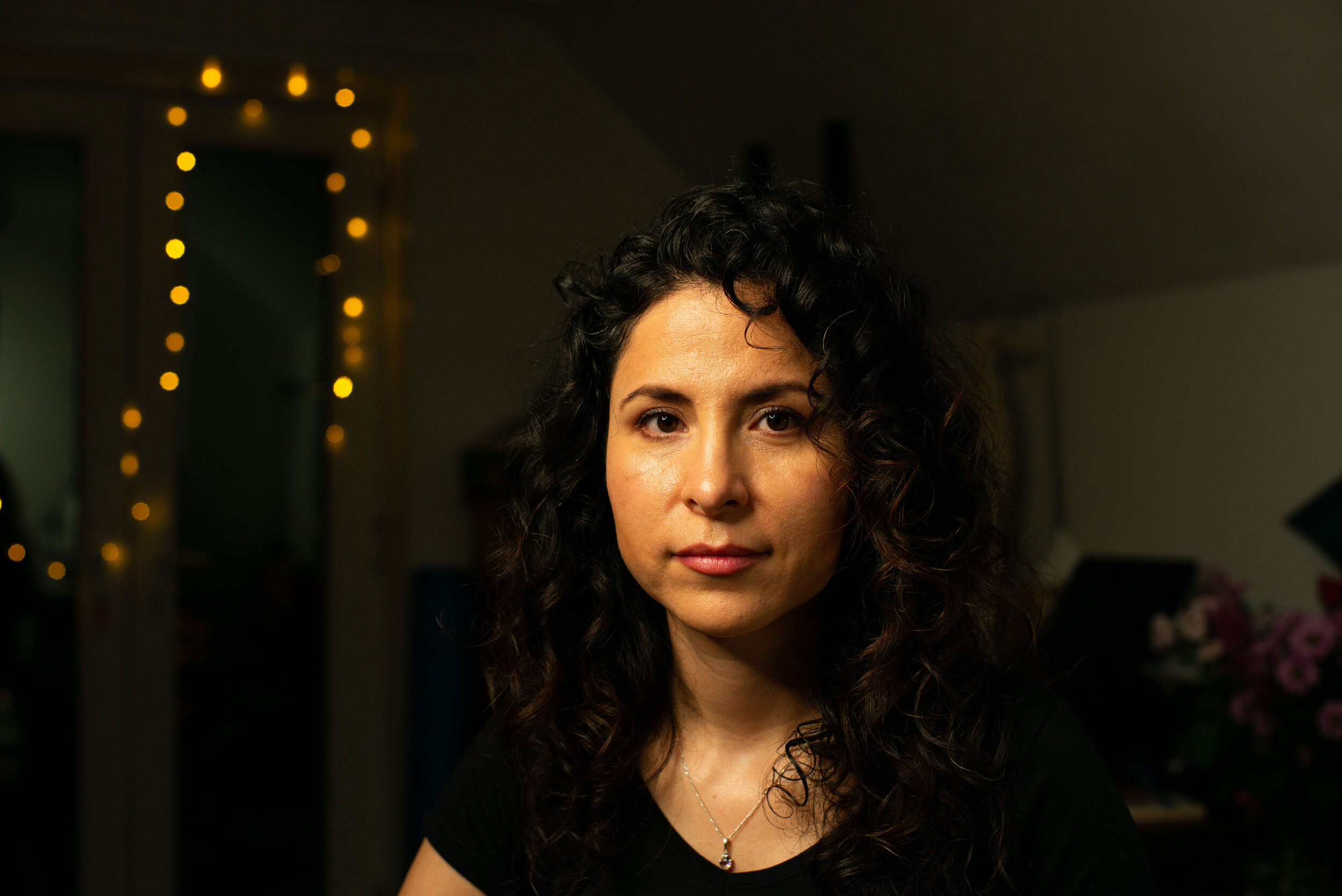
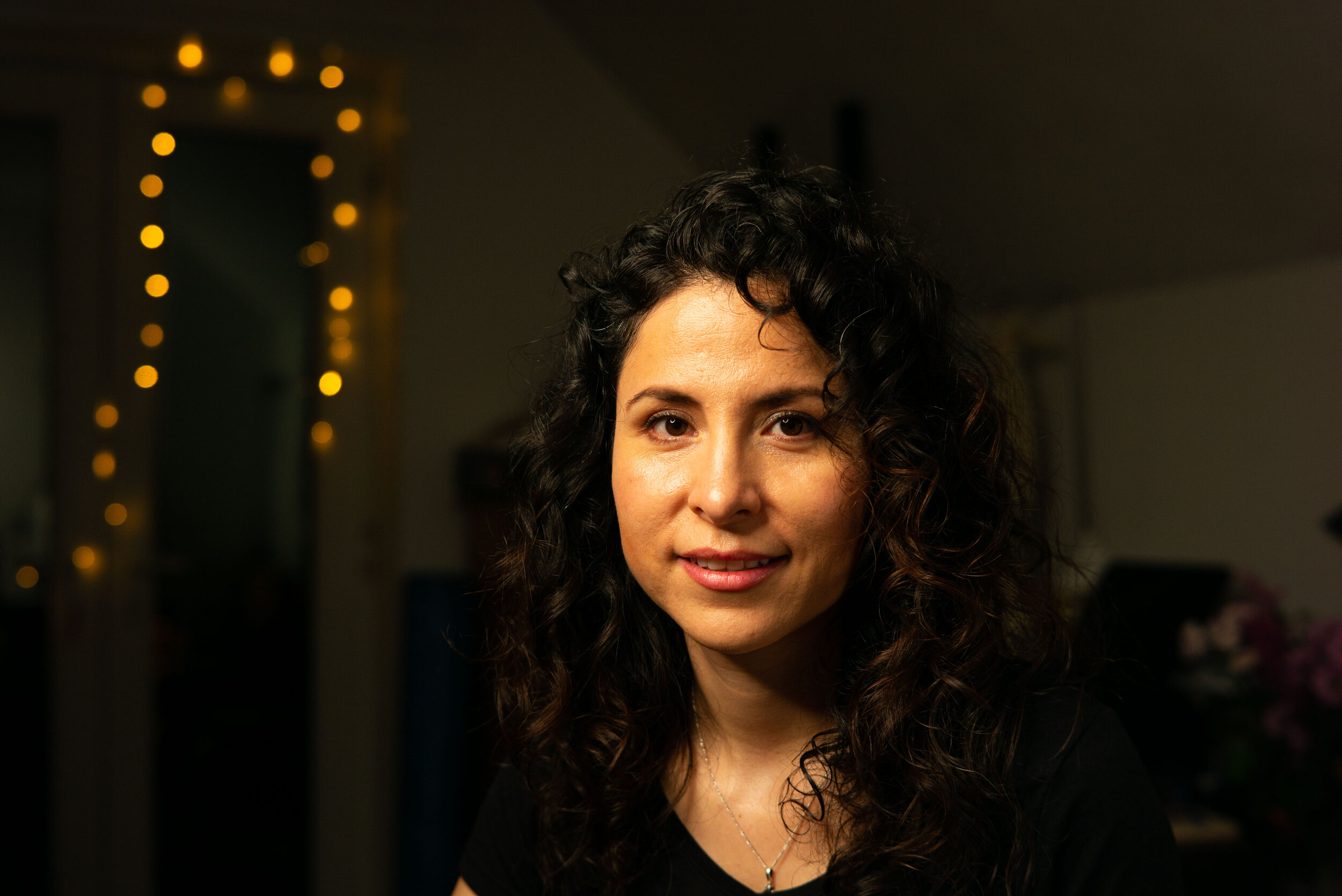
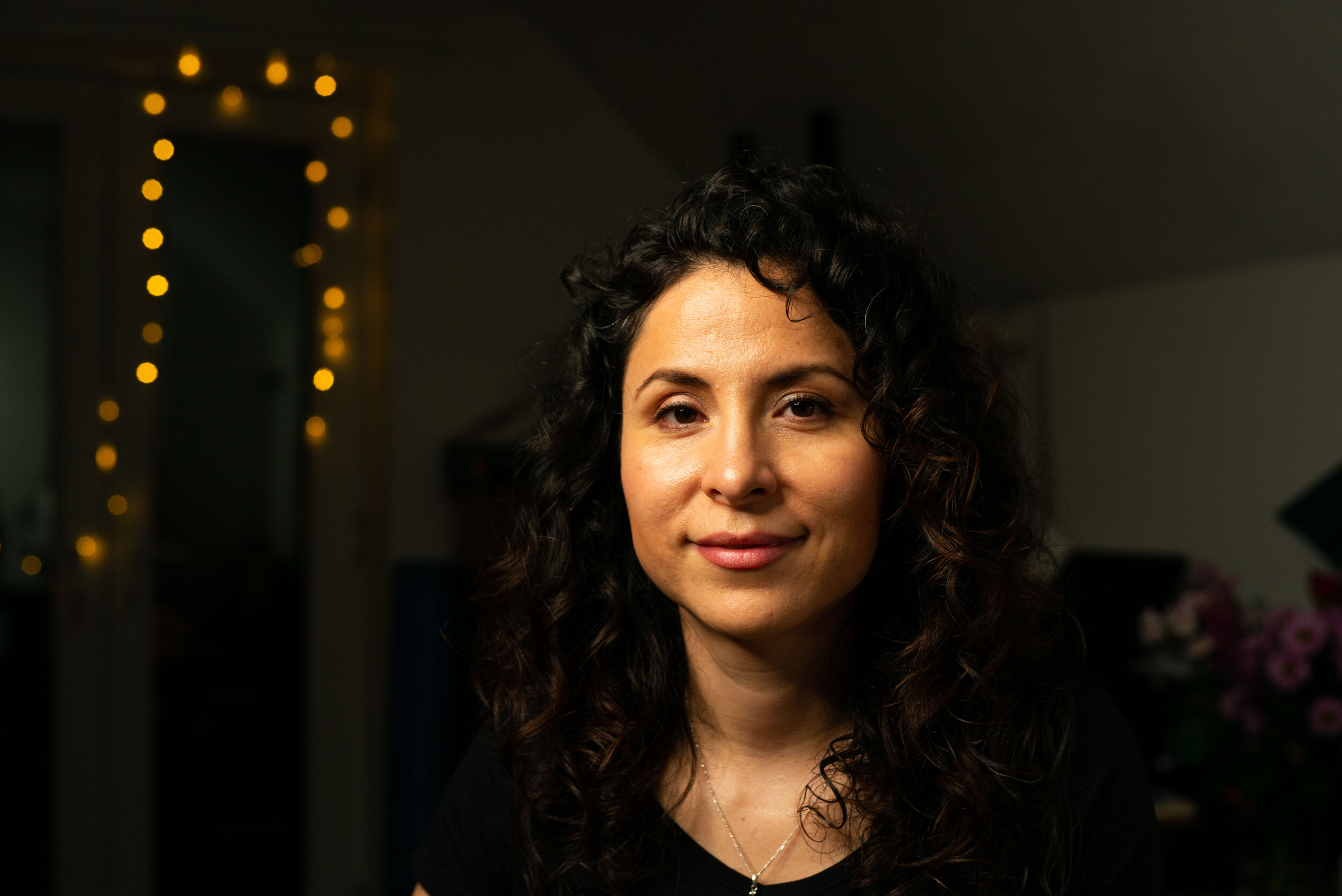
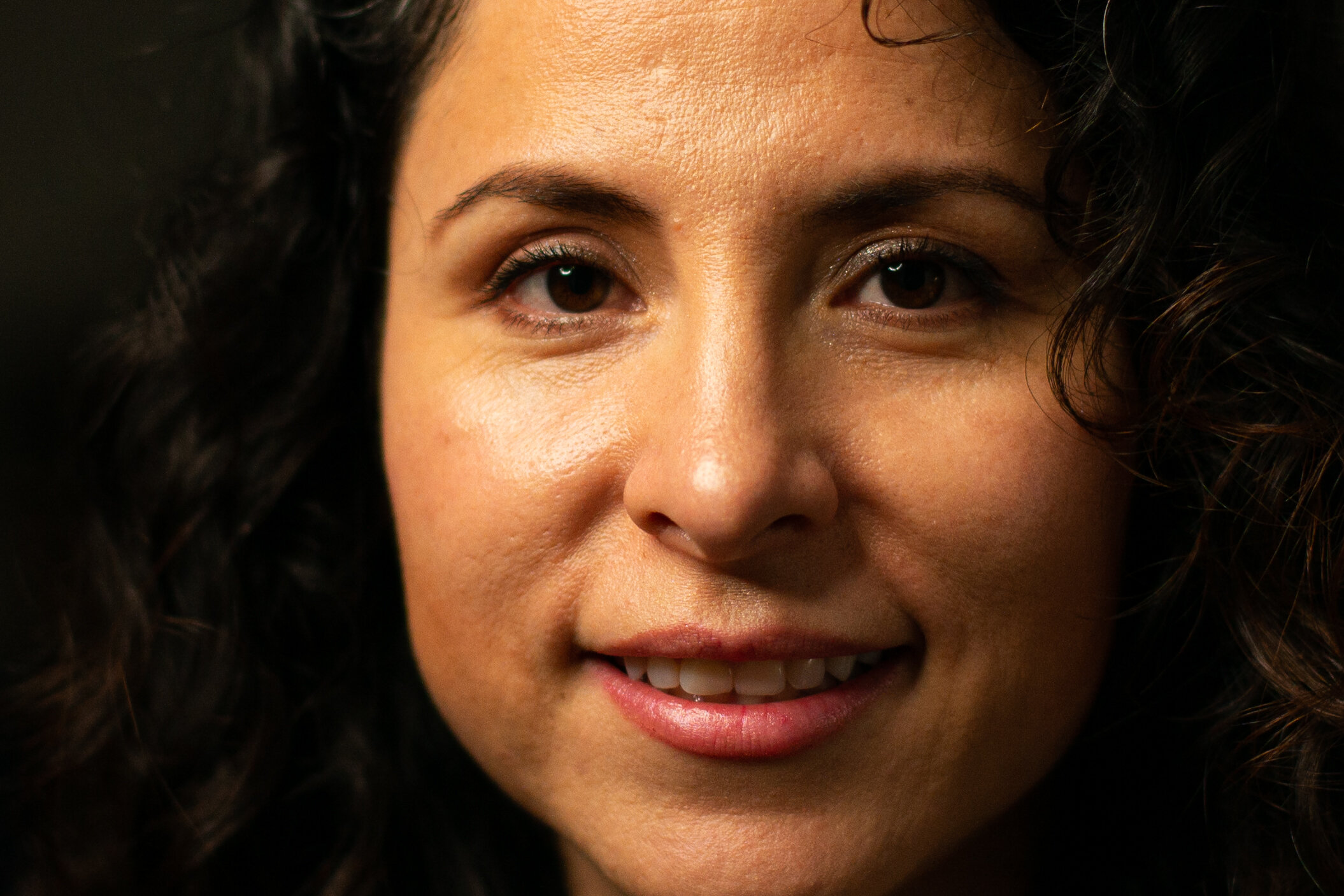
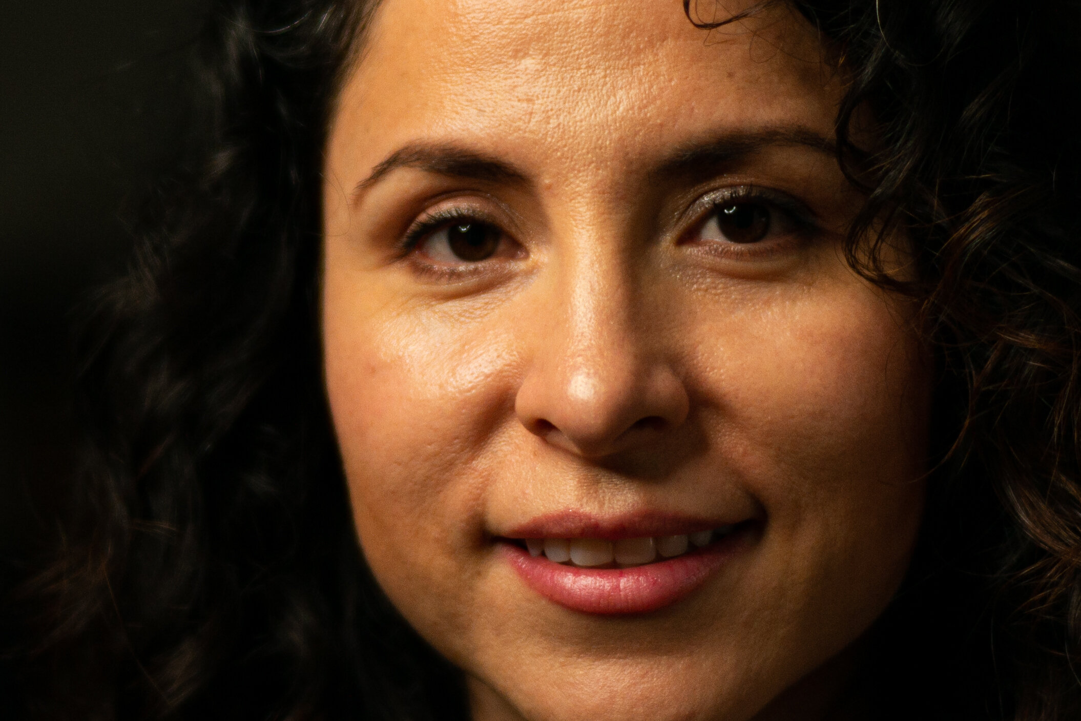
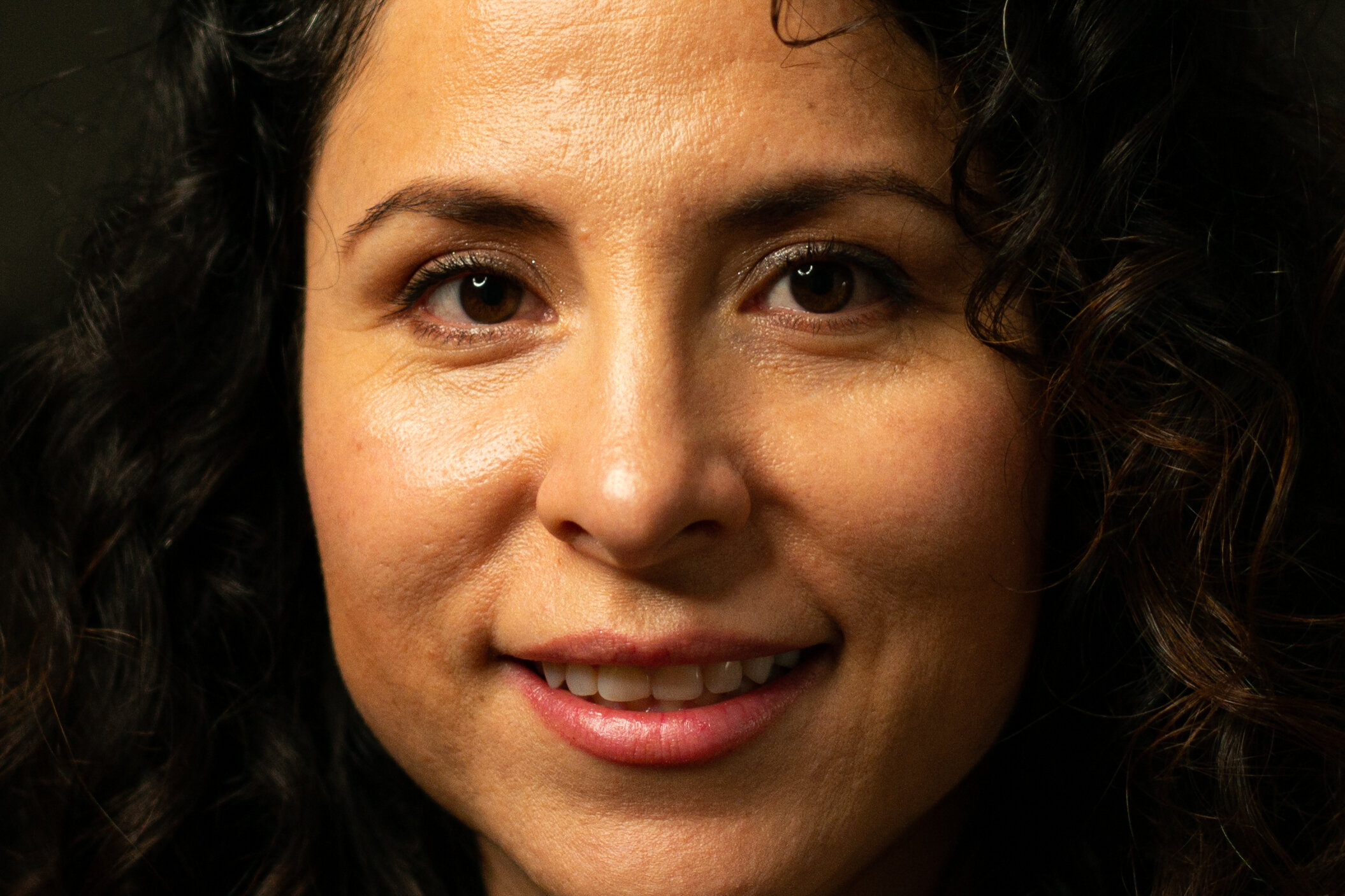
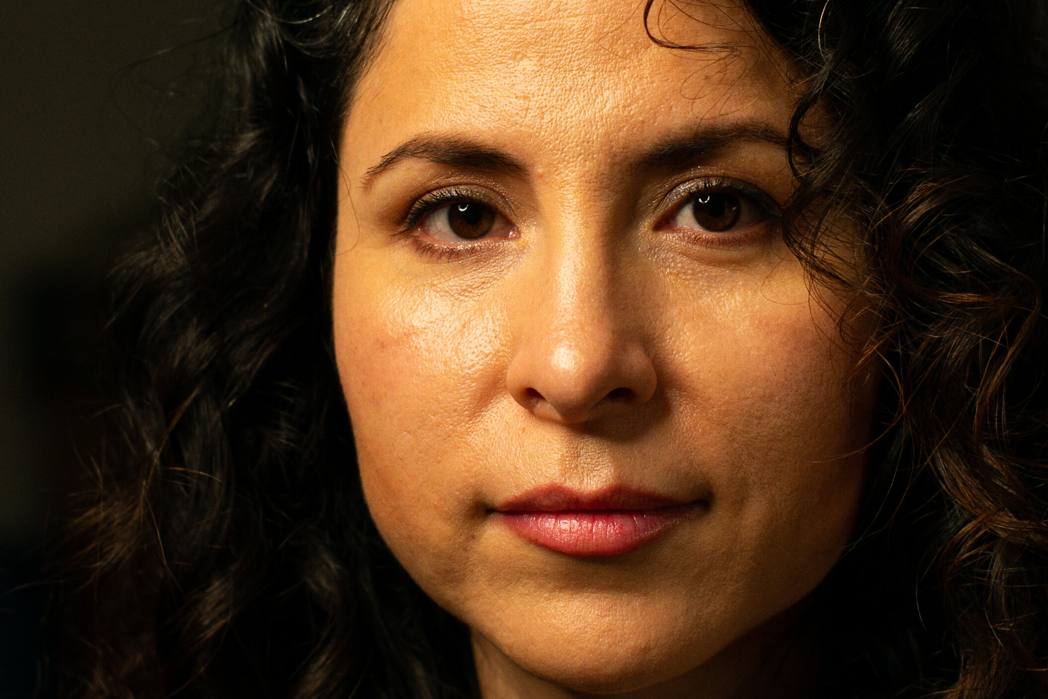
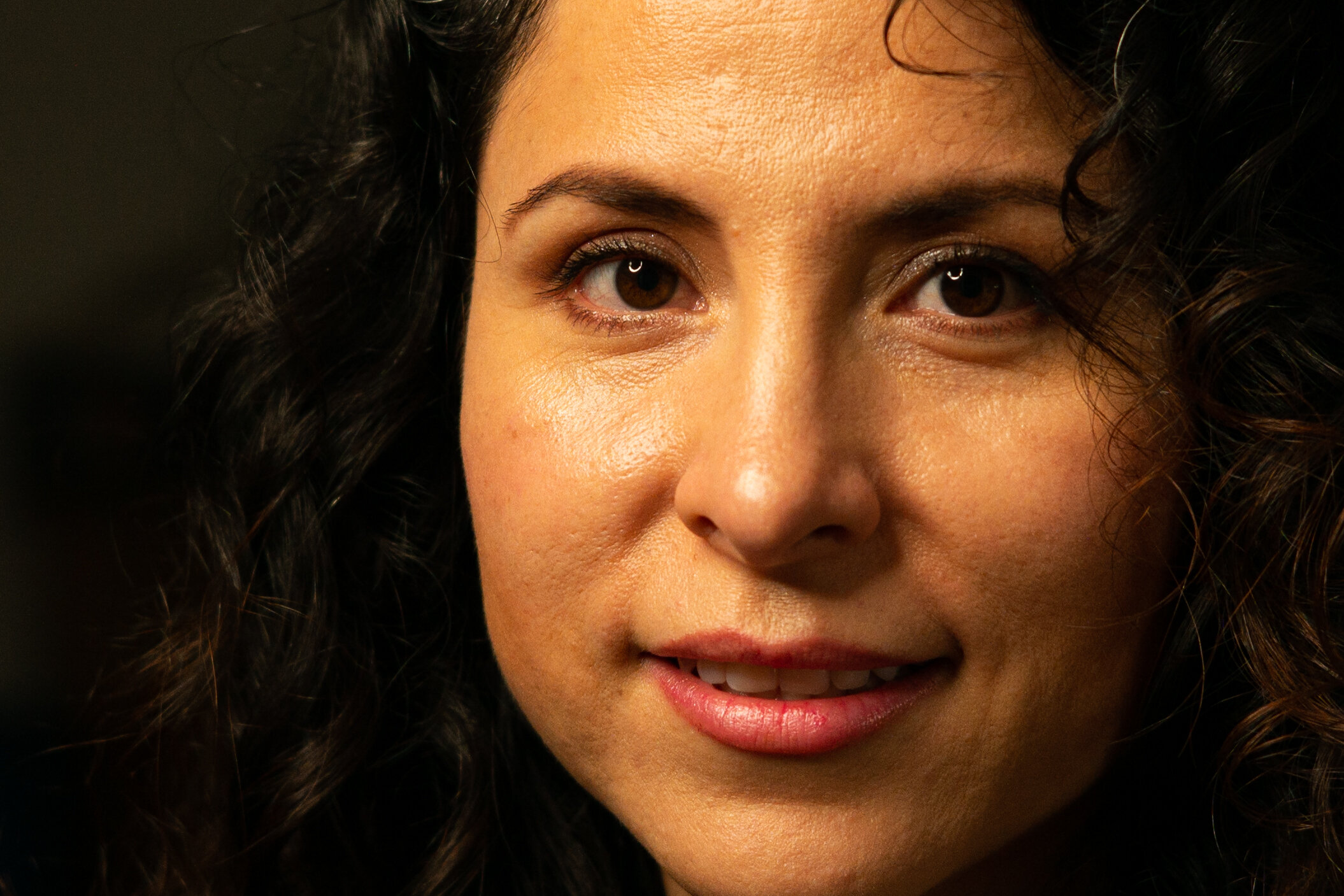
Portrait performance
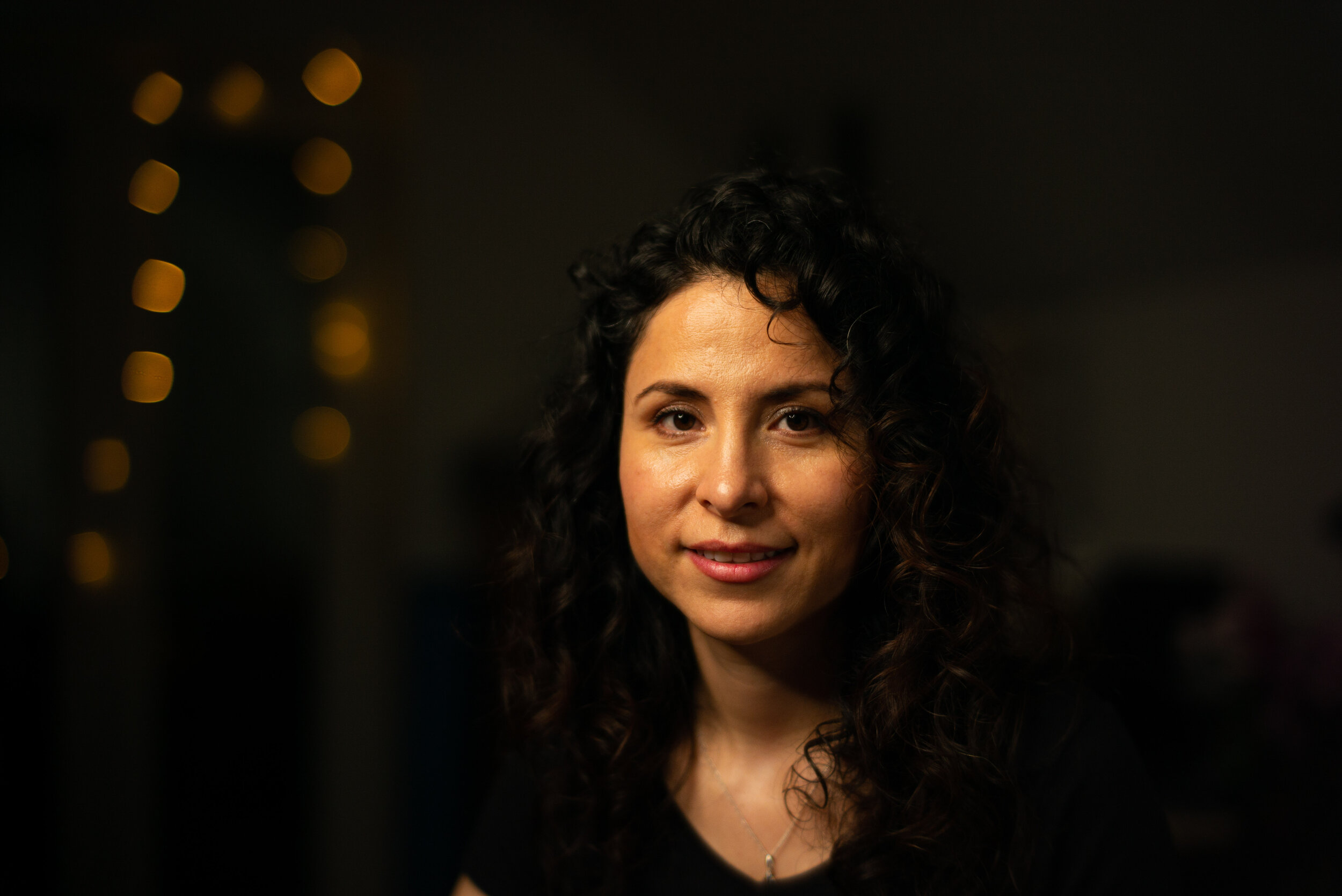
All this bokeh talk is worth nothing if you don’t have a sharp subject in front of it. Hopefully an interesting, meaningful subject, so you won’t be studying the bokeh instead of looking at what you are supposed to in the image. One of the main applications for subject isolation with blurry background is the portrait. The 50mm lens is a good choice for head and shoulders portraits, it does not have a lot of compression but lacks the distortion that a wider lens would have with the same framing. The setup for this series is simple: I found a beautiful subject (my lovely wife Daniela), switched the lights off in the room and set up a light at around 45 degrees above and to the right of her. A reflector was placed on the opposite side to soften the shadows (I wasn’t going for Rembrandt lighting). Unfortunately my flash equipment is limited, so no matter how I tried I wasn’t able to get a passable rim light around the hair (wrong colour temperature and not enough power) so I decided to forgo such refinement for testing purposes. Each lens was refocused on the closest eye at every aperture using the EVF. I didn’t ask Daniela to smile all the time, I didn’t want her to develop a rictus grin!
I will show the shots from each lens at apertures from wide open to F4. There is no point in testing smaller aperture values, the images become indistinguishable between different lenses: they are all excellent at that point. The detail crops will be shown after the main series and in the comparison grids section. All the images are unedited, straight out of camera into Lightroom and exported directly. No adjustments. No crop.
Here we go: if you want to just skip to the summary click here.
F1.1/1.2


Pretty good detail straight away from the Nokton 1.1. The Nokton 1.2 is really rich and defined. The 7Artisans 1.1 looks like a cheesy “film look” filter applied in Instagram, and there is a lot less detail recorded. I won’t be commenting on the transition to the out of focus area, because I don’t think we can really tell from these portraits. The only thing we can see well is the overall look and the sharpness on the eye.
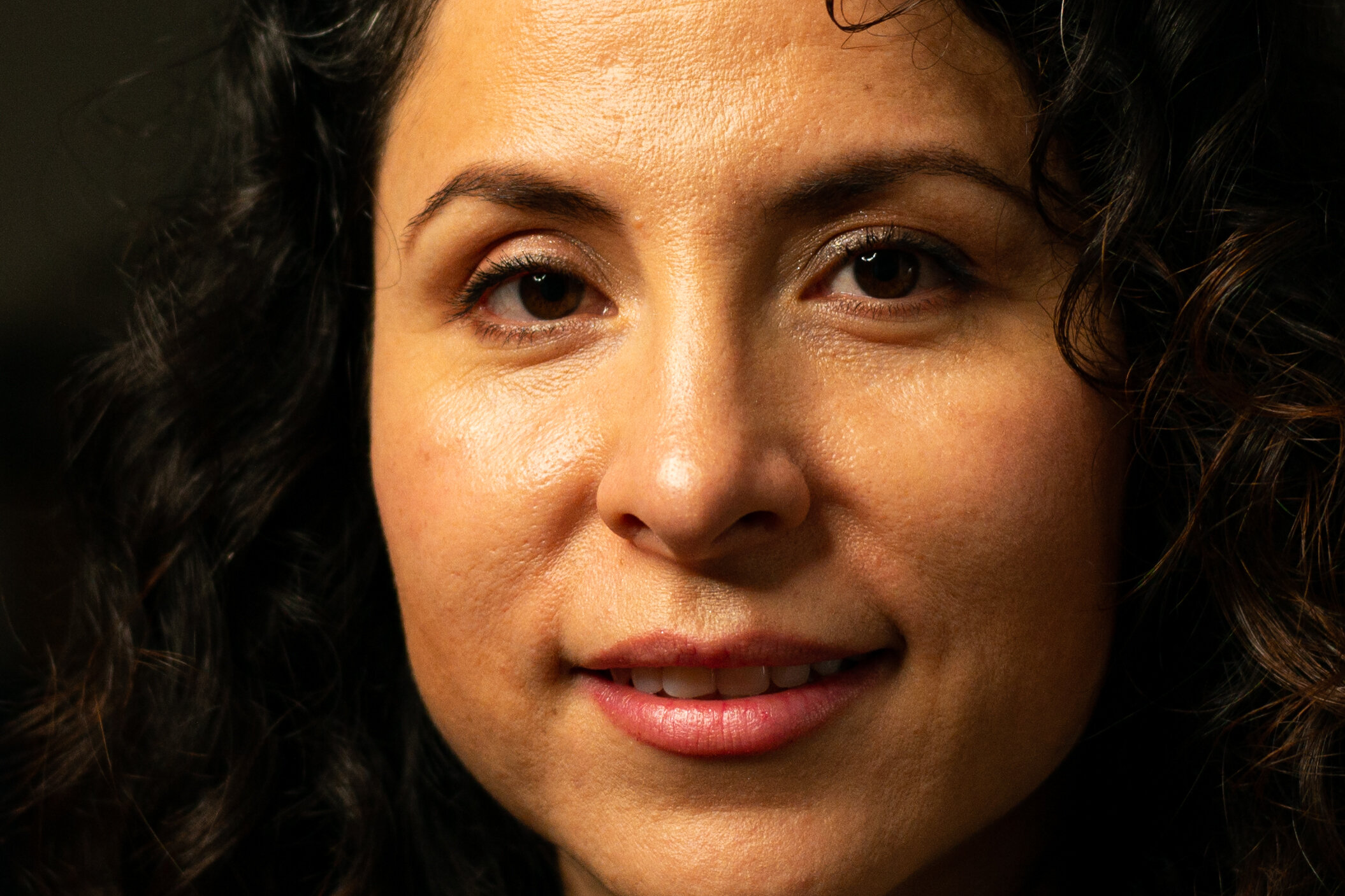
F1.4/1.5


All lenses are already looking great: the 7Artisans 1.1 has improved dramatically. The Summilux 1.4 and TTArtisan 1.4 are outstanding, they have a “sparkle”, something more than the others. I did miss focus on the Nokton 1.5 II, the plane of focus is half-way between the eyes, and this robs the closest eye of sharpness. I didn’t detect that on the rear screen of the camera! We can still see that all the Noktons show a tiny amount of spherical aberration compared to the best performers. The two Sonnar designs are the least defined, with the Sonnar 1.5 showing a slightly softer image.
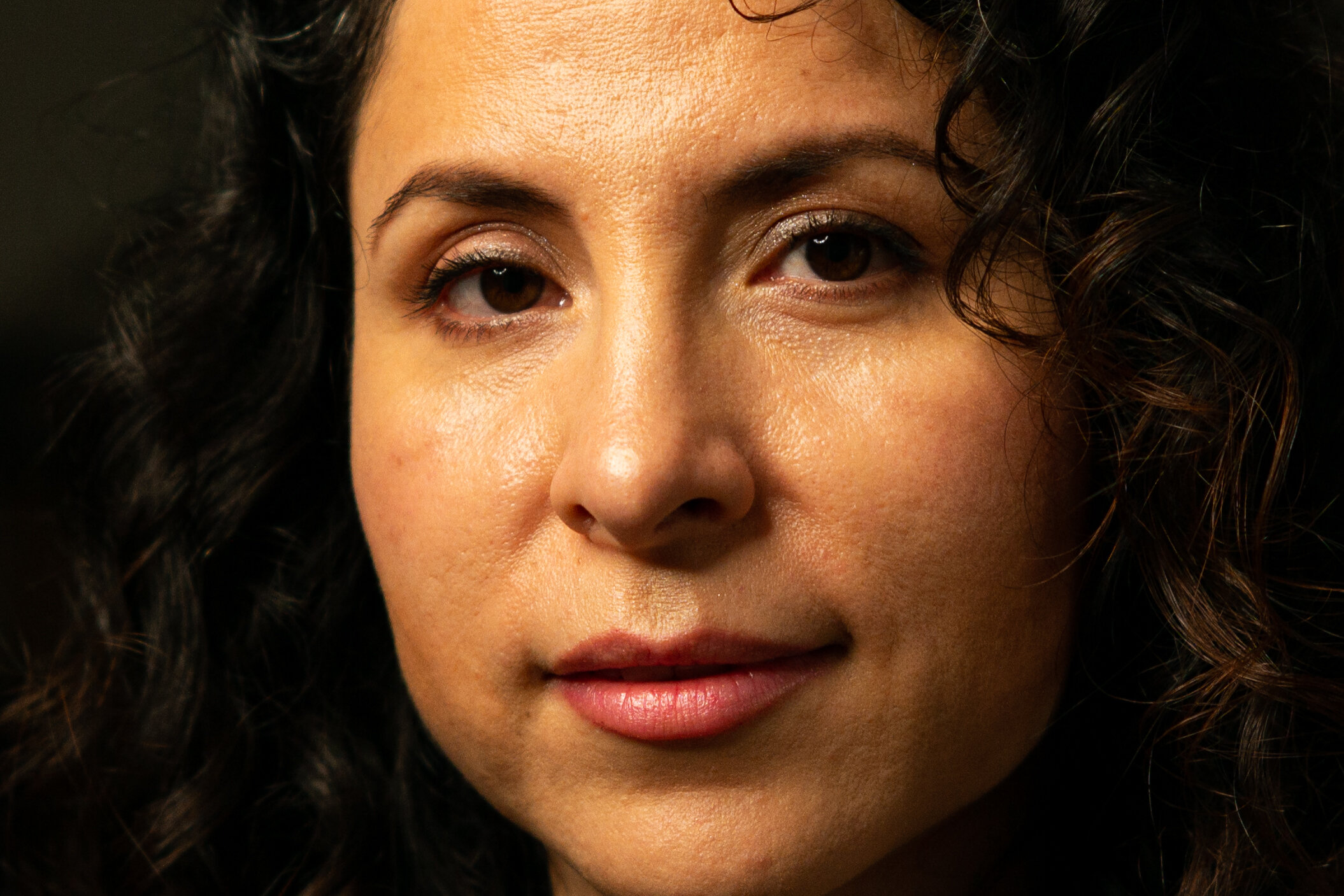
F2


The TTArtisan 1.4 is not sparkling as much now but only because I missed slightly focus on the closest eye, while the Summilux 1.4 definitely is still sparkling. Also the Nokton 1.2, the Nokton 1.5 II and the Summicron F2 are really sparkling, there is something more in those images. Is that micro-contrast? The Nokton 1.5 is almost there as well, while the rest are merely looking great. I mean, all of these lenses are really delivering, but 5 of them give a little more. Even the 7Artisans 1.1, although not the sharpest, looks great.
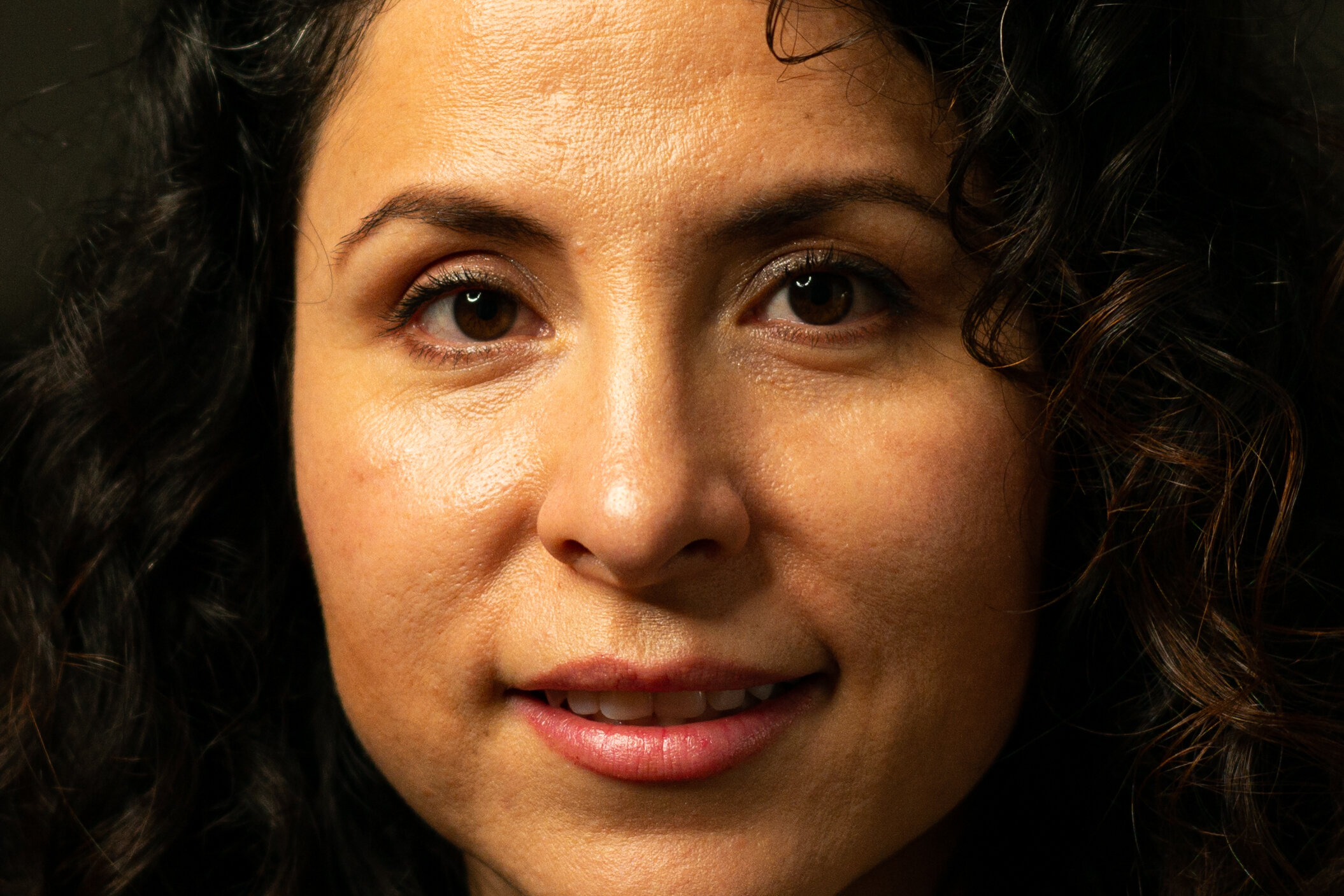
F2.8


All images are stunning technically. The least attractive to me is the Planar F2 image, I can’t put my finger on why. The ones that jump out of the screen are both the Leica ones. I can’t help being particularly drawn to them. Is there something about the Leica micro-contrast after all? It seems so. Is it worth the premium these lenses command? Only you can judge. This is the only instance where I see a real difference. Is that enough to really set them apart?
F4


Only the Summilux 1.4 is still standing out now for me. The difference is subtle and I’m seeing the images at full resolution. I have no idea if you can see what I am seeing.
Perhaps a series of crops of wide open and F2.8 shots for all lenses can shed some light on what I am talking about:
Wide open


F2.8


The grids will be of the same images as above and the detail of the eyes. I noticed I have missed precise focus on two or three frames but for the purposes of this test it doesn’t make a difference. Click here for a larger version of the full frame grid, here for the eye detail grid.


Portrait summary
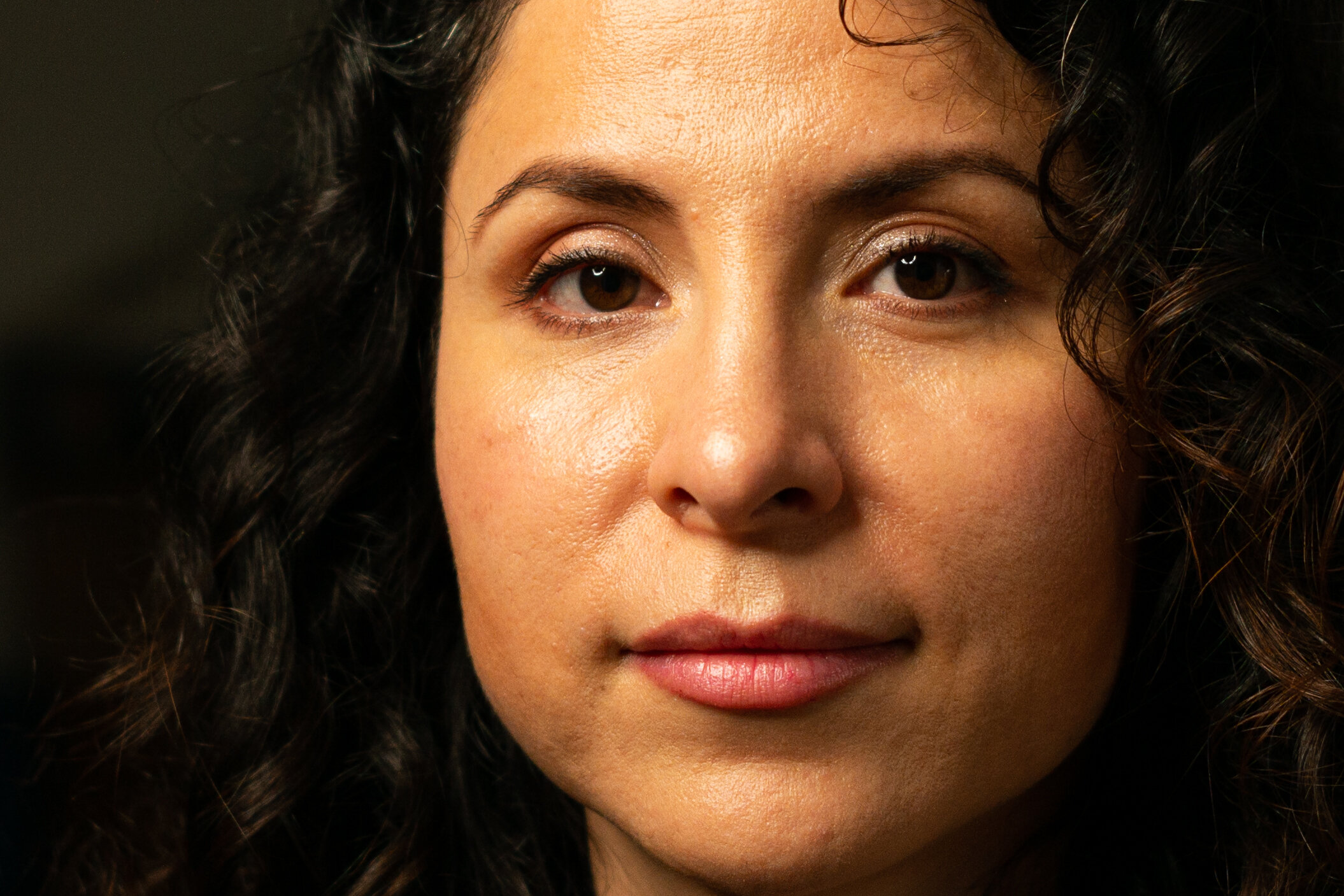
Most lenses are already performing well wide open, The exceptions are the Sonnar designs and the 7Artisans 1.1 in particular, with a rendering that reminds me of the gossip magazine covers from the 70s. I’m not a fan of that look. Stopping down it improved straight away. The Summilux 1.4 and the TTArtisan 1.4 show a “sparkle” wide open that is missing from the other images. I did miss focus with the Nokton 1.5 II but all four of the Noktons show a little uncorrected spherical aberration wide open at this distance. At F2 all lenses are already performing at an excellent level. The Summicron F2 is also showing the “sparkle” while the TTArtisan 1.4 lost some of it. The Summilux 1.4 is the only one mantaining it throughout the test, followed closely by its venerable Leica sibling. Is that the fabled Leica micro-contrast? At F2.8 all lenses look fantastic. I could have stopped there. Ultimately, with a studio-like setting as this you would normally shoot stopped down to get the whole face in focus and no one would be able to tell which lens is which from F2 in a blind test. They all look great. Another takeaway from this test is that when you shoot a closer distance portrait wide open with a fast lens you should expect to miss focus a lot: even using the EVF and a tripod, with Daniela sitting in a chair, I managed to miss. I have to blame in part the live view shutter lag of the Leica M240: it’s horrible, it can be measured in geological eras. After you acquire focus you press the shutter button and have to hope that the subject does not breathe or move a half centimetre while waiting for the camera to actually shoot. After the test I shot a few more actual portraits of Daniela with the setup but off tripod and with the rangefinder. That was a lot more enjoyable and rewarding. Mind you, I was shooting at F2.8! Here is an example: can you tell which lens I used?
This section concludes the testing for this comparison. In Part 4 we will draw the conclusions and summarise the strengths and weaknesses of each lens. I won’t declare a “winner”, this is not a contest: each lens is a compromise of choices made by the manufacturer and many factors will be playing a part in directing the choice of a potential buyer. I certainly made my choice and I will only keep one of these lenses. I will tell which one and why in the final words of the fourth chapter. Click here or below to go to Part 4.